General theming
The configuration properties on this page affect all Unblu UIs.
Colors
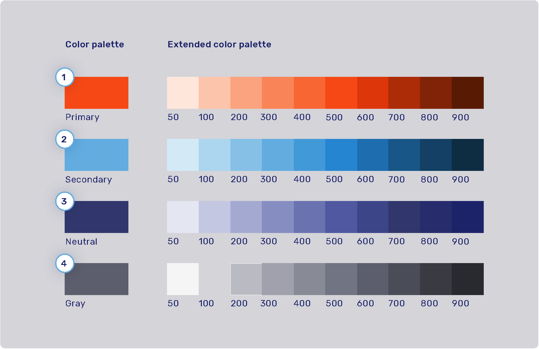
The product color palette is defined by four main colors: primary, secondary, neutral, and gray. Each of these colors has an extended color palette composed of varying degrees of saturation/brightness which can be used throughout various elements of the user interface.
For the syntax of the values these color properties can hold, refer to Color values.
-
Primary palette: com.unblu.theme.color.primary
Extended primary color palette:
-
Secondary palette: com.unblu.theme.color.secondary
Extended secondary color palette:
-
Neutral palette: com.unblu.theme.color.neutral
Extended neutral color palette:
-
Gray palette: com.unblu.theme.color.gray
Extended gray color palette:
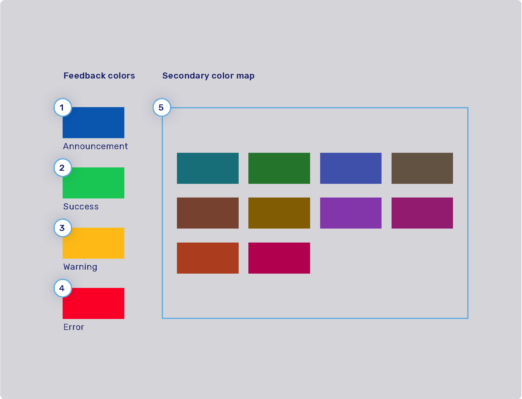
Feedback colors and secondary color map
-
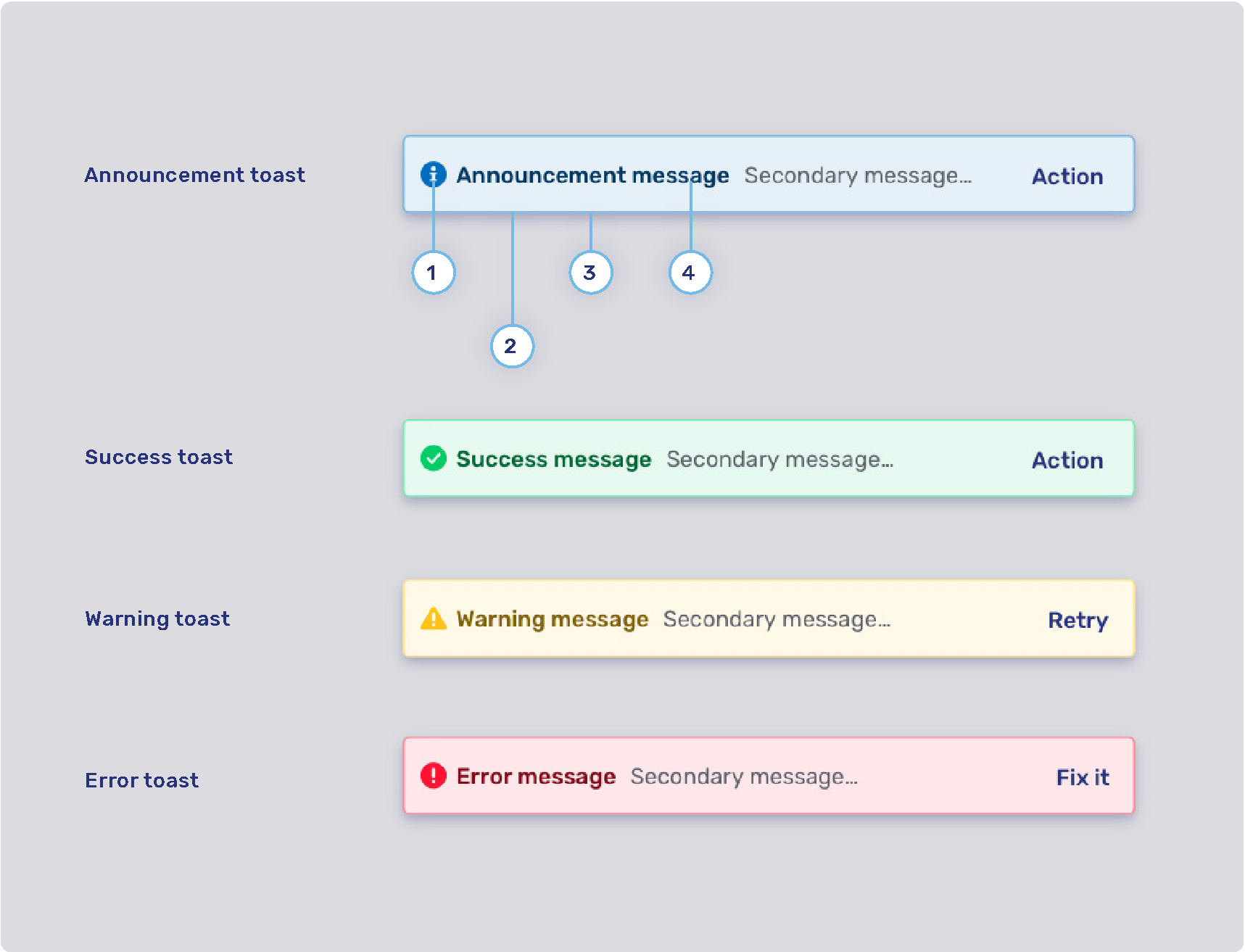
Announcement highlight color: com.unblu.theme.color.announcement
-
Success highlight color: com.unblu.theme.color.success
-
Warning highlight color: com.unblu.theme.color.warning
-
Error highlight color: com.unblu.theme.color.error
-
Secondary color map: com.unblu.theme.color.secondaryColorMap.
Colors used for secondary elements such as avatars and virtual mouse cursor labels are chosen randomly from a set of colors determined in the configuration key above.
The info toasts for the various feedback types are configured separately. Refer to Info toasts below.
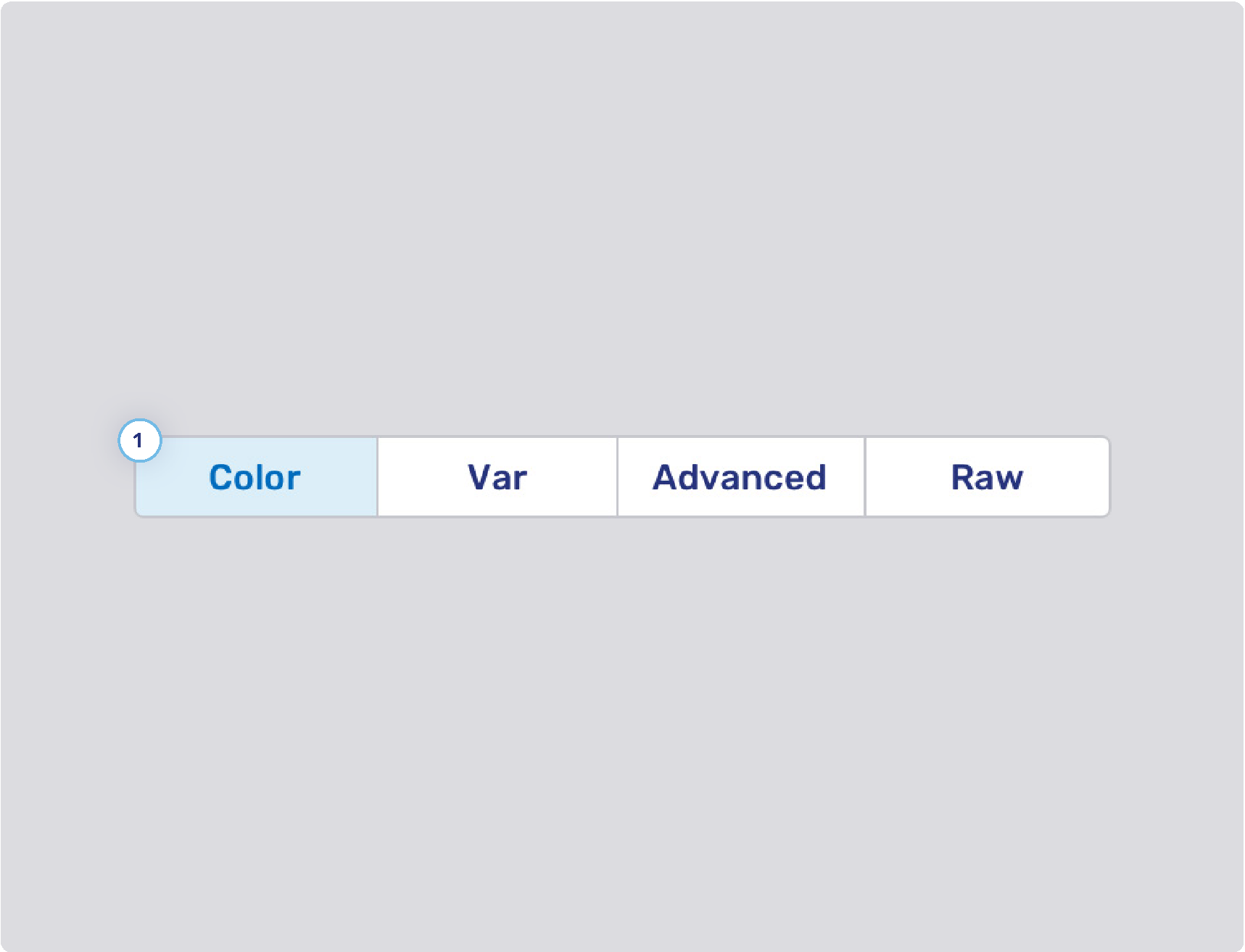
Finding an element’s color configuration property
While you’re configuring the Unblu UIs to better match your organization’s design guidelines, a common problem is determining which configuration property you need to change to modify the color of a certain UI element (or set of UI elements). This is actually easier than it may seem, because the names of the CSS custom properties that specify the color of a UI element correspond closely to the name of the configuration property where it’s defined.
To find the color configuration property for a particular UI element, proceed as described below. The terms used refer to Google Chrome and may differ slightly in other browsers such as Mozilla Firefox or Safari. In Safari, you must enable the option Show features for web developers in the Advanced settings to follow the steps.
-
In the Unblu UI, right-click the element you’re interested in, then click Inspect. This opens your browser’s developer tools and highlights the element you clicked in the Elements panel.
You can confirm which element is selected by moving your cursor over the elements in the panel. This highlights the corresponding element in the UI.
-
With the element of interest selected in the Elements panel, switch to the Styles pane if it isn’t already displayed. You can now review the styling of the element.
Colors appear with a small preview of the color itself as well as the variable reference to the custom CSS property used. For example, the sidebar of the Agent Desk includes the following styling:
background-color: var(--com-unblu-nav-ui-navBarBackground); -
Copy the name of the variable that defines the color. Be sure to include the leading hyphens
--. -
Open the Account Configuration interface. In the sidebar, click Settings in the Account section.
-
On the Settings tab, paste the reference to the custom CSS property into the Filter box. This automatically translates the property name into the configuration property key and displays the configuration property so you can change its value.
Often, the color of a UI element refers to a color defined in another, more general configuration property. If you want to change the color across all UI elements, adapt the configuration property for the color palette, not the UI element.
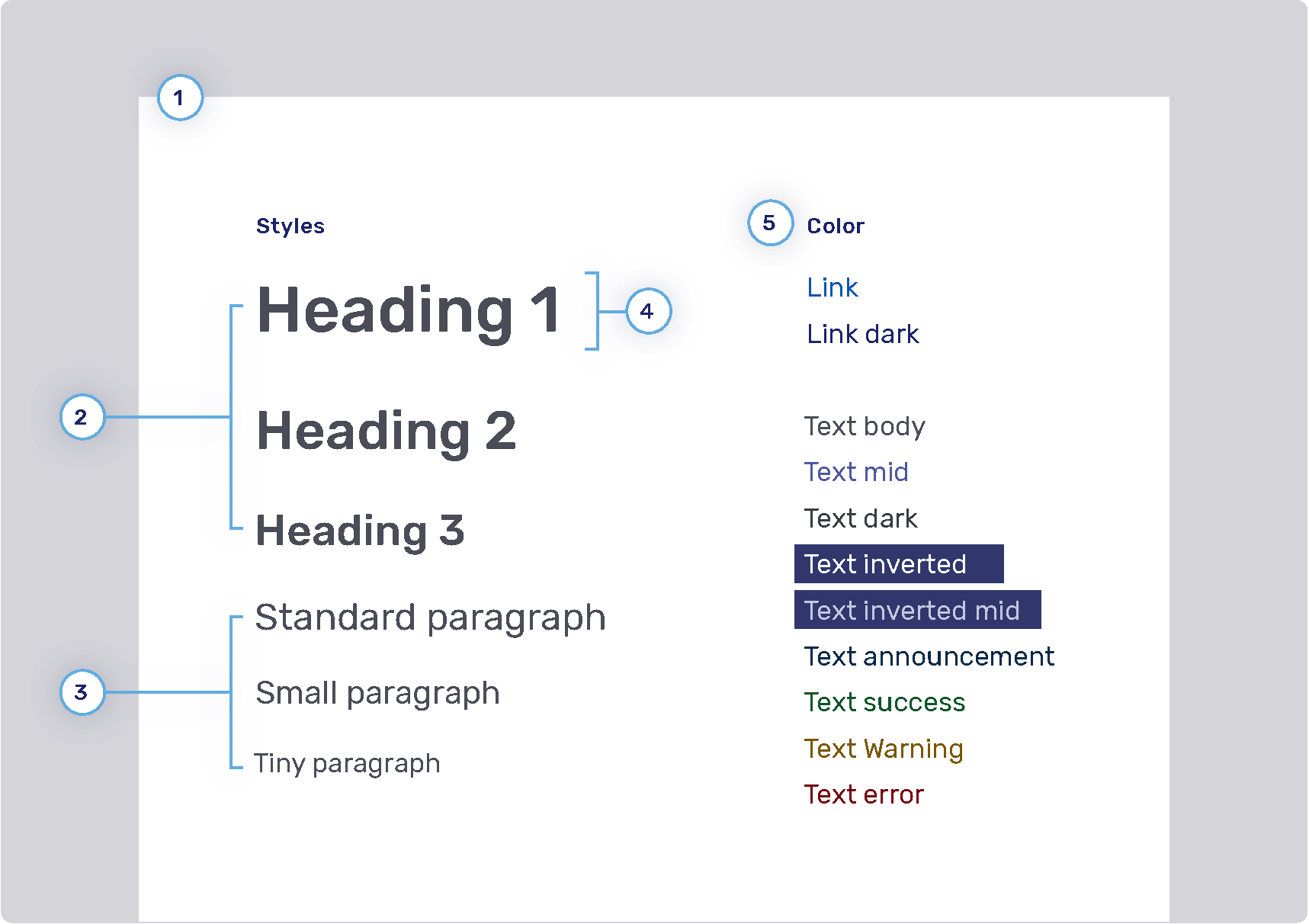
Font
You can configure the size, color, and weight of text, but you can’t configure its placement in the UI. For example, if the UI uses a header 1 style, you can’t change it to header 2.
-
Font family
-
Headings
-
Weight
-
Sizes
-
Heading 1: com.unblu.theme.font.heading1Size
-
Heading 2: com.unblu.theme.font.heading2Size
-
Heading 3: com.unblu.theme.font.heading3Size
-
-
Color
-
-
Paragraphs
-
Sizes
-
-
Font line height
-
Font color
-
Link
-
Text
-
Inverted: com.unblu.theme.font.colorTextInverted
-
Inverted mid: com.unblu.theme.font.colorTextInvertedMid
-
Announcement: com.unblu.theme.font.colorTextAnnouncement
-
Warning: com.unblu.theme.font.colorTextWarn
-
Action accent: com.unblu.theme.font.colorTextActionAccent
-
Buttons
-
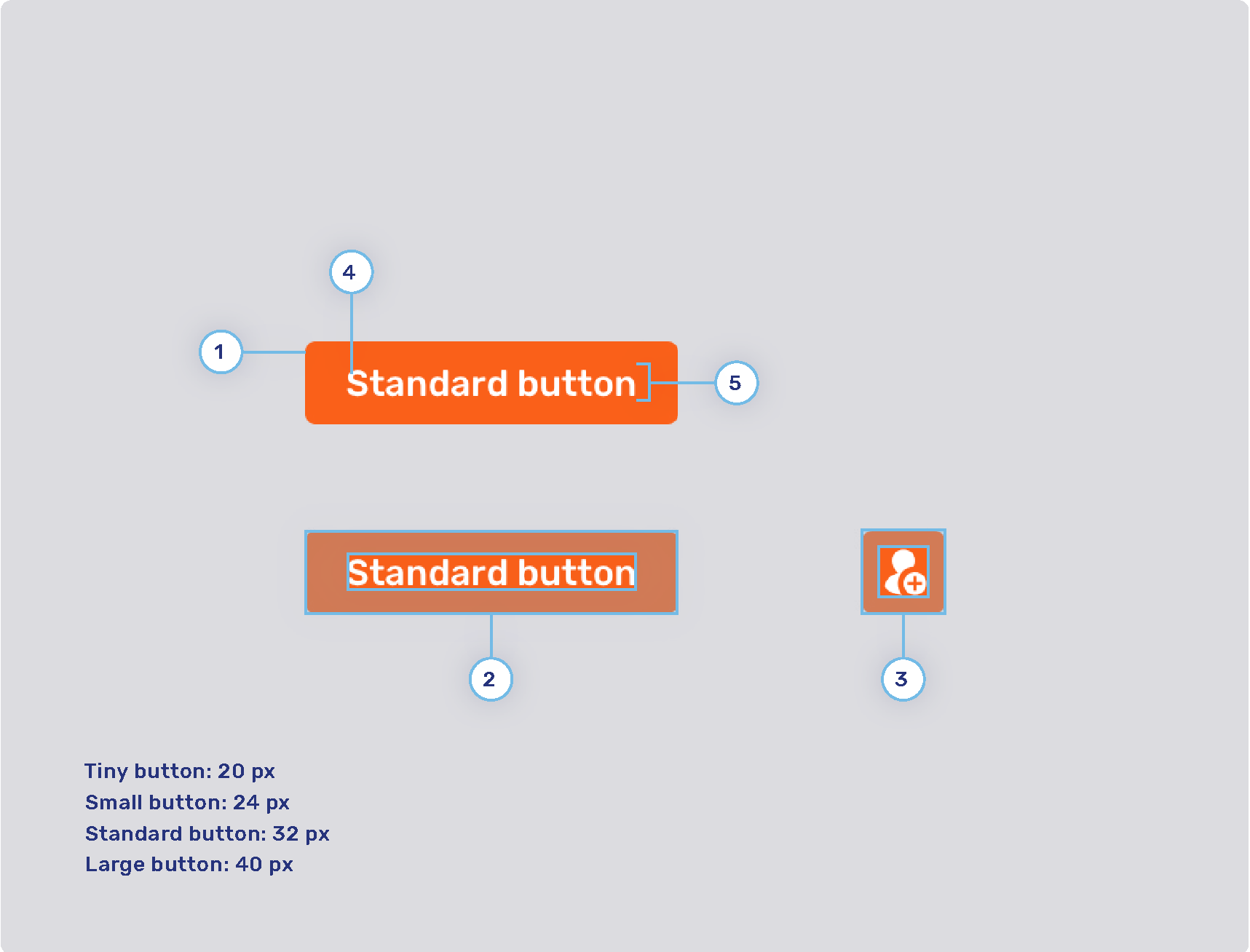
Radius
-
Button padding
-
Tiny button
-
Small button
-
Standard button
-
Large button
-
-
Icon button padding
-
Tiny button
-
Small button
-
Standard button
-
Large button
-
-
Font weight
-
Line height
Primary and secondary buttons
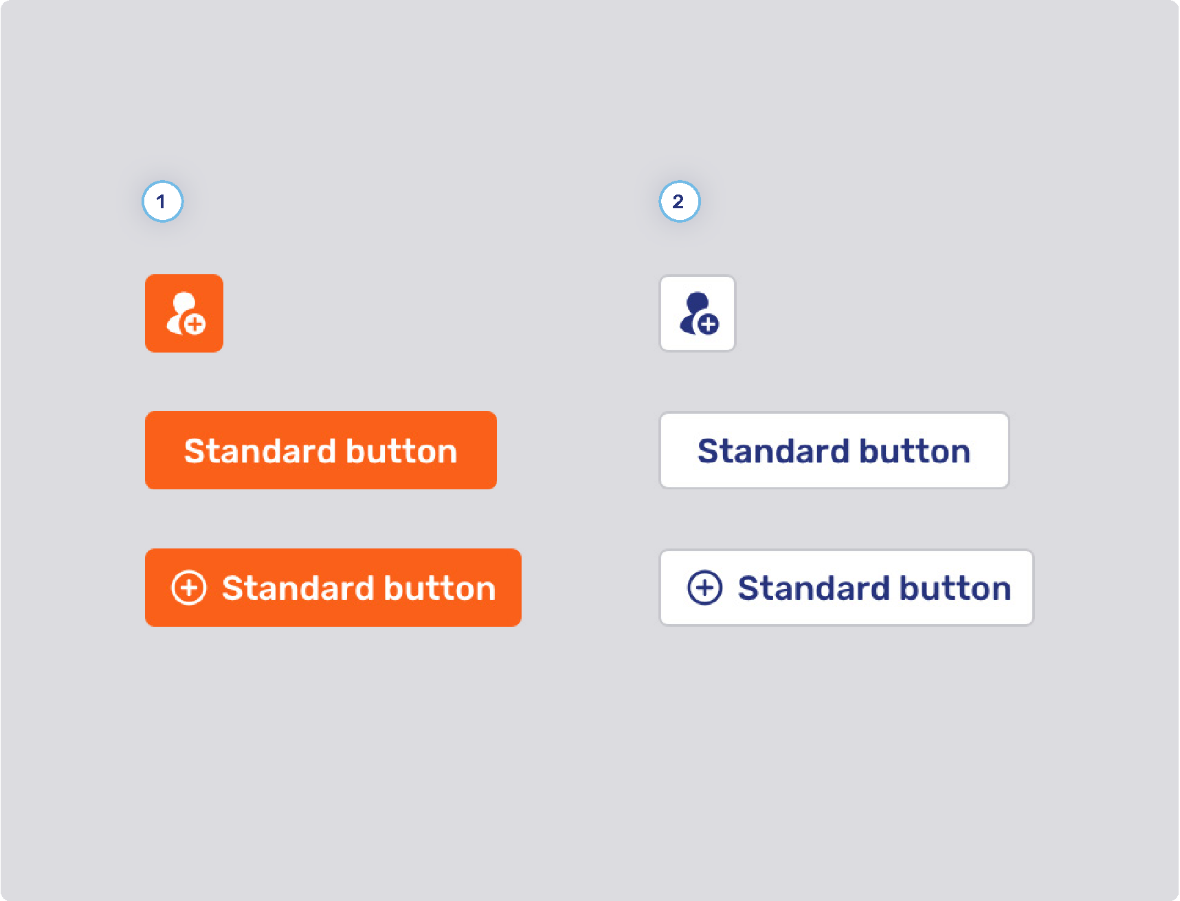
-
Primary button style
-
Background states
-
Border width
-
Border states
-
Foreground states
-
-
Secondary button style
-
Background states
-
Border width
-
Border states
-
Foreground states
-
-
Other
-
Minimum button width
-
com.unblu.conversation.messaging.ui.multiChoiceButtonMinWidth
This configuration property only applies to buttons for multiple choice questions.
-
-
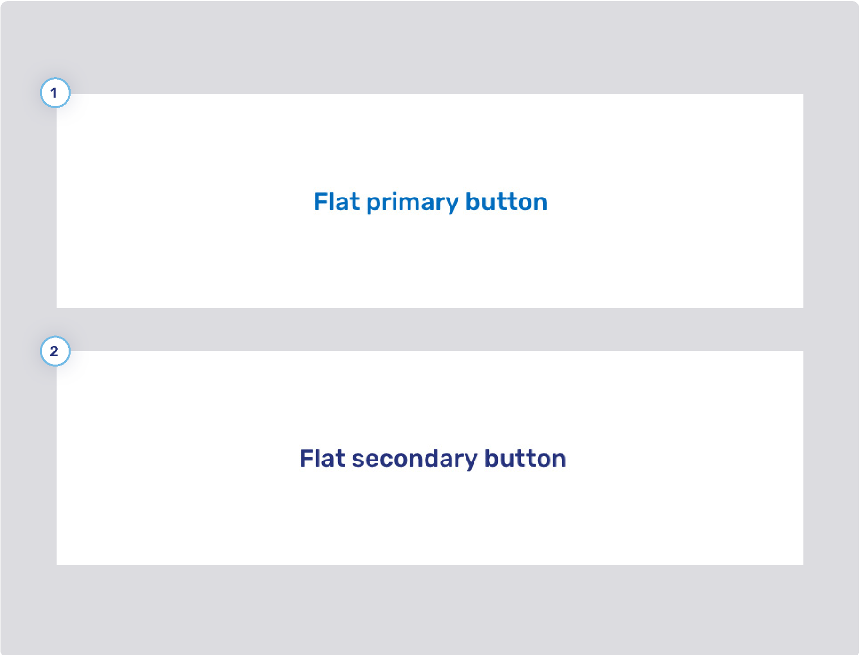
Flat primary and secondary buttons
-
Flat primary button style
-
Background states
-
Border width
-
Border states
-
Foreground states
-
-
Flat secondary button style
-
Background states
-
Border width
-
Border states
-
Foreground states
-
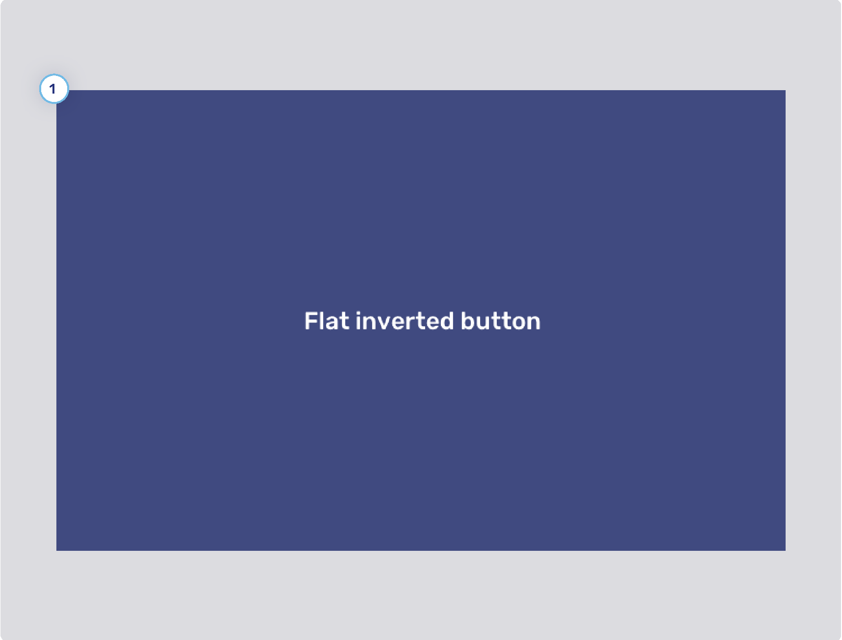
Flat inverted buttons
-
Background states
-
Border width
-
Border states
-
Foreground states
Toggle buttons
-
Background states
-
Border width
-
Border states
-
Foreground states
Flat toggle buttons
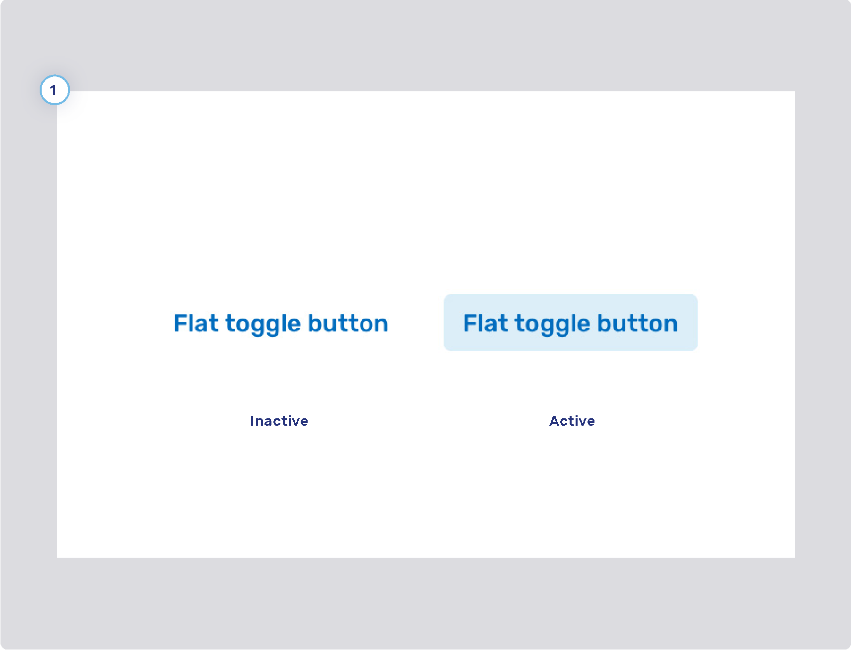
-
Background states
-
Border width
-
Border states
-
Foreground states