UI theming cheat sheet on a single page
This page combines the theming configuration property information in a single page. This allows you to search the configuration properties using Ctrl+F in your browser.
General theming
The configuration properties on this page affect all Unblu UIs.
Colors
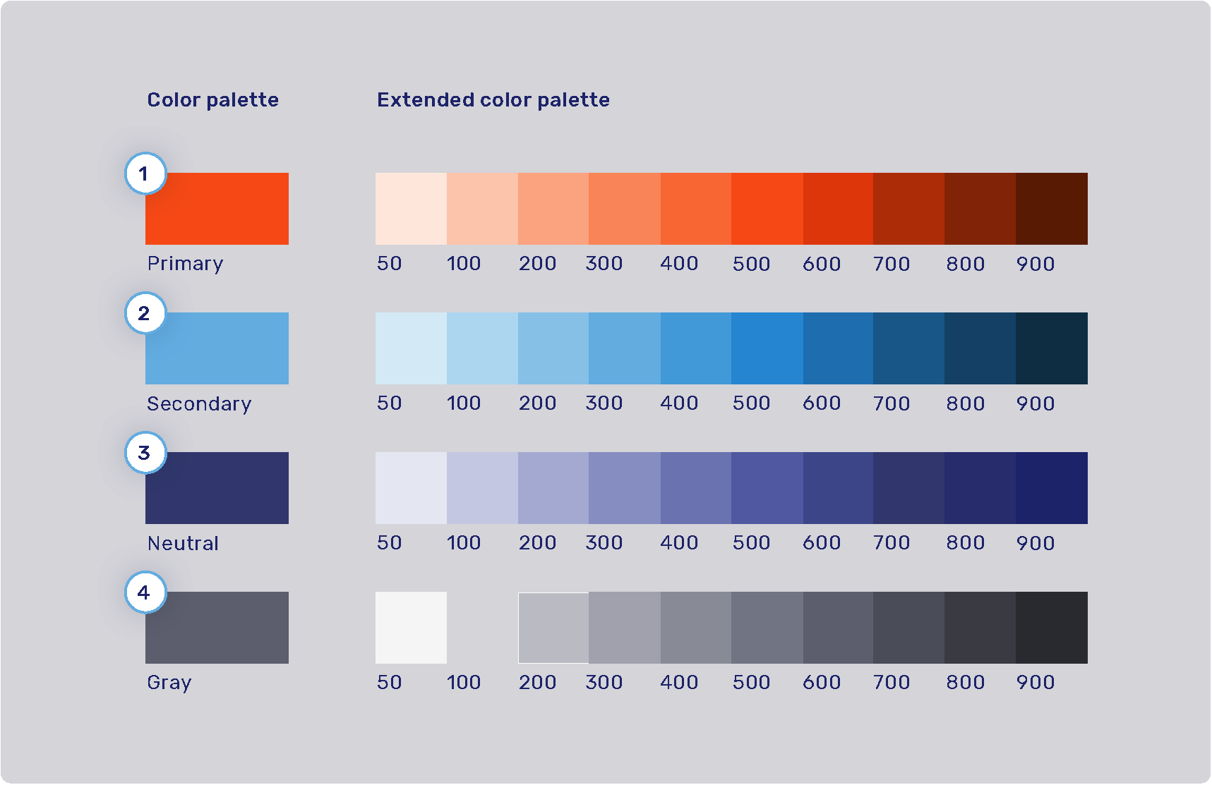
The product color palette is defined by four main colors: primary, secondary, neutral, and gray. Each of these colors has an extended color palette composed of varying degrees of saturation/brightness which can be used throughout various elements of the user interface.
For the syntax of the values these color properties can hold, refer to Color values.
-
Primary palette: com.unblu.theme.color.primary
Extended primary color palette:
-
Secondary palette: com.unblu.theme.color.secondary
Extended secondary color palette:
-
Neutral palette: com.unblu.theme.color.neutral
Extended neutral color palette:
-
Gray palette: com.unblu.theme.color.gray
Extended gray color palette:
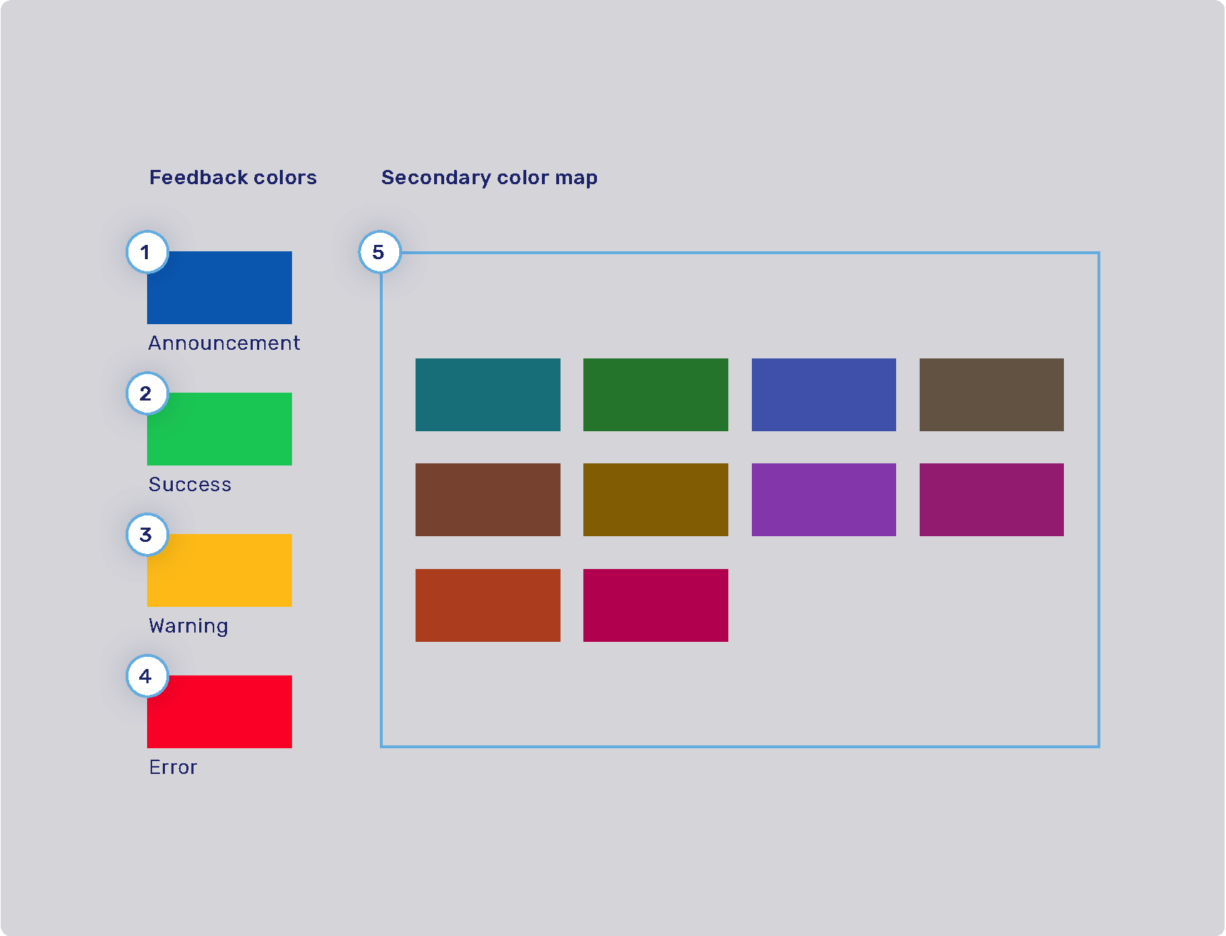
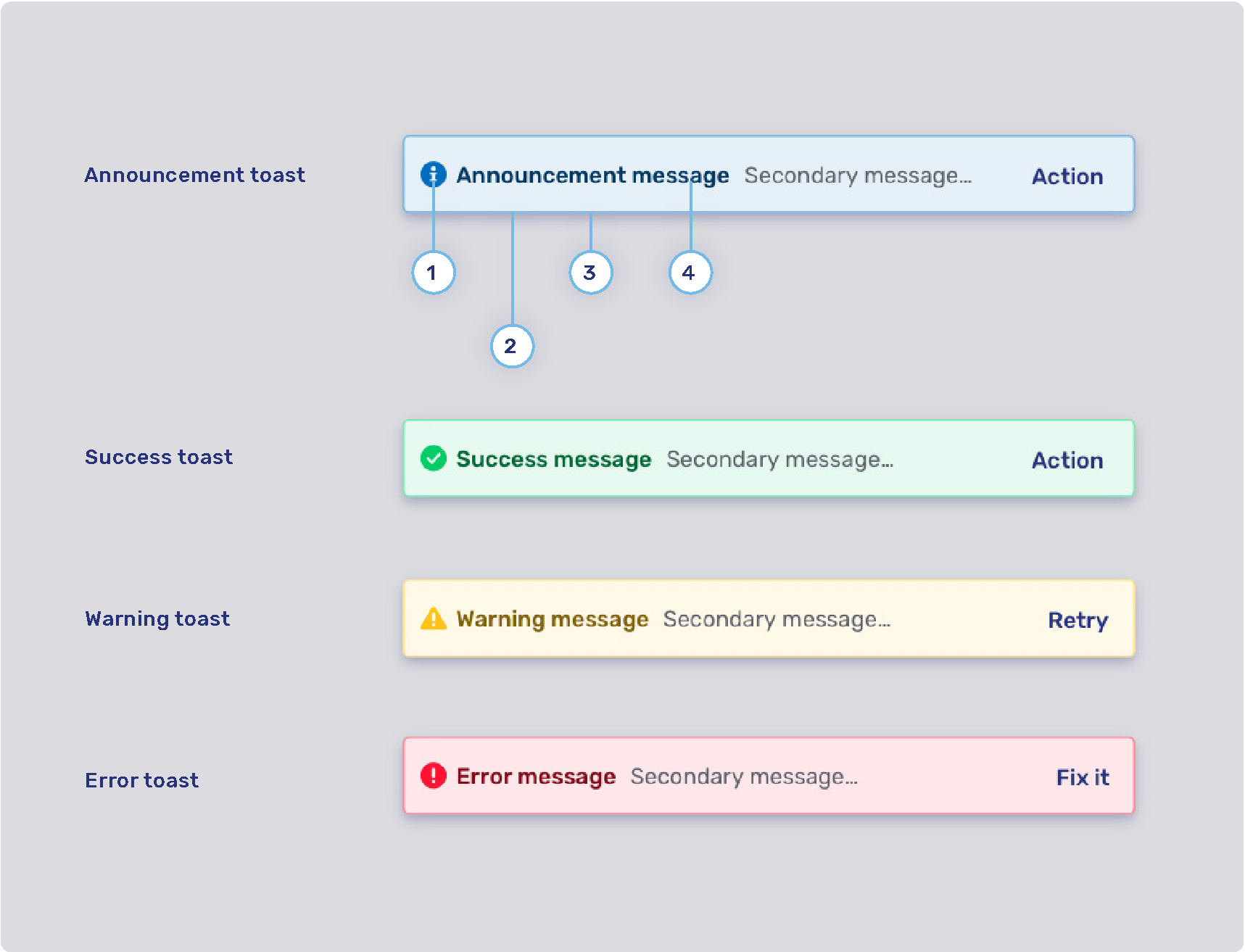
Feedback colors and secondary color map
-
Announcement highlight color: com.unblu.theme.color.announcement
-
Success highlight color: com.unblu.theme.color.success
-
Warning highlight color: com.unblu.theme.color.warning
-
Error highlight color: com.unblu.theme.color.error
-
Secondary color map: com.unblu.theme.color.secondaryColorMap.
Colors used for secondary elements such as avatars and virtual mouse cursor labels are chosen randomly from a set of colors determined in the configuration key above.
The info toasts for the various feedback types are configured separately. Refer to Info toasts below.
Finding an element’s color configuration property
While you’re configuring the Unblu UIs to better match your organization’s design guidelines, a common problem is determining which configuration property you need to change to modify the color of a certain UI element (or set of UI elements). This is actually easier than it may seem, because the names of the CSS custom properties that specify the color of a UI element correspond closely to the name of the configuration property where it’s defined.
To find the color configuration property for a particular UI element, proceed as described below. The terms used refer to Google Chrome and may differ slightly in other browsers such as Mozilla Firefox or Safari. In Safari, you must enable the option Show features for web developers in the Advanced settings to follow the steps.
-
In the Unblu UI, right-click the element you’re interested in, then click Inspect. This opens your browser’s developer tools and highlights the element you clicked in the Elements panel.
You can confirm which element is selected by moving your cursor over the elements in the panel. This highlights the corresponding element in the UI.
-
With the element of interest selected in the Elements panel, switch to the Styles pane if it isn’t already displayed. You can now review the styling of the element.
Colors appear with a small preview of the color itself as well as the variable reference to the custom CSS property used. For example, the sidebar of the Agent Desk includes the following styling:
background-color: var(--com-unblu-nav-ui-navBarBackground); -
Copy the name of the variable that defines the color. Be sure to include the leading hyphens
--. -
Open the Account Configuration interface. In the sidebar, click Settings in the Account section.
-
On the Settings tab, paste the reference to the custom CSS property into the Filter box. This automatically translates the property name into the configuration property key and displays the configuration property so you can change its value.
Often, the color of a UI element refers to a color defined in another, more general configuration property. If you want to change the color across all UI elements, adapt the configuration property for the color palette, not the UI element.
Font
You can configure the size, color, and weight of text, but you can’t configure its placement in the UI. For example, if the UI uses a header 1 style, you can’t change it to header 2.
-
Font family
-
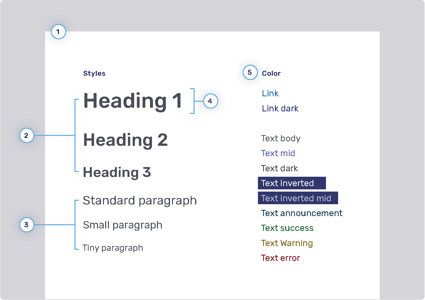
Headings
-
Weight
-
Sizes
-
Heading 1: com.unblu.theme.font.heading1Size
-
Heading 2: com.unblu.theme.font.heading2Size
-
Heading 3: com.unblu.theme.font.heading3Size
-
-
Color
-
-
Paragraphs
-
Sizes
-
-
Font line height
-
Font color
-
Link
-
Text
-
Inverted: com.unblu.theme.font.colorTextInverted
-
Inverted mid: com.unblu.theme.font.colorTextInvertedMid
-
Announcement: com.unblu.theme.font.colorTextAnnouncement
-
Warning: com.unblu.theme.font.colorTextWarn
-
Action accent: com.unblu.theme.font.colorTextActionAccent
-
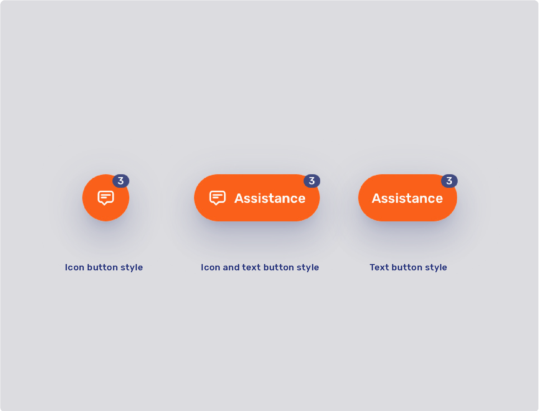
Buttons
-
Radius
-
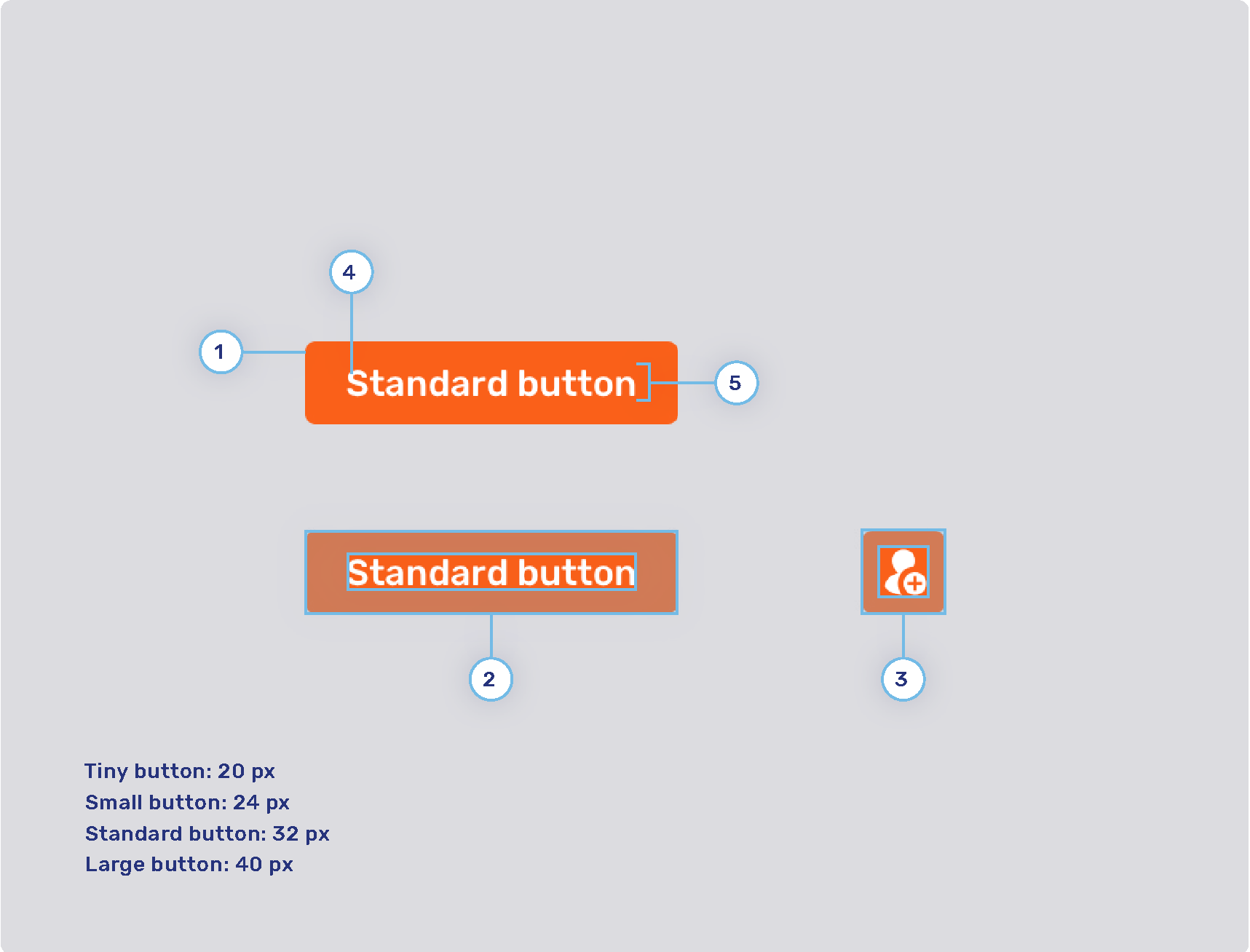
Button padding
-
Tiny button
-
Small button
-
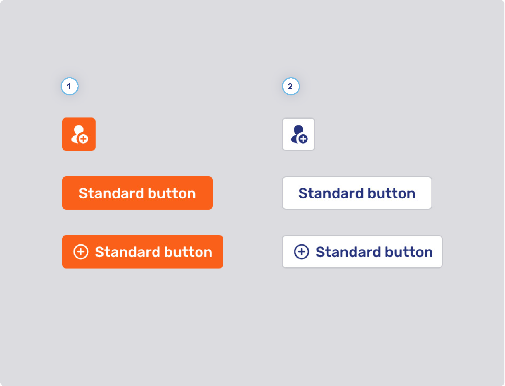
Standard button
-
Large button
-
-
Icon button padding
-
Tiny button
-
Small button
-
Standard button
-
Large button
-
-
Font weight
-
Line height
Primary and secondary buttons
-
Primary button style
-
Background states
-
Border width
-
Border states
-
Foreground states
-
-
Secondary button style
-
Background states
-
Border width
-
Border states
-
Foreground states
-
-
Other
-
Minimum button width
-
com.unblu.conversation.messaging.ui.multiChoiceButtonMinWidth
This configuration property only applies to buttons for multiple choice questions.
-
-
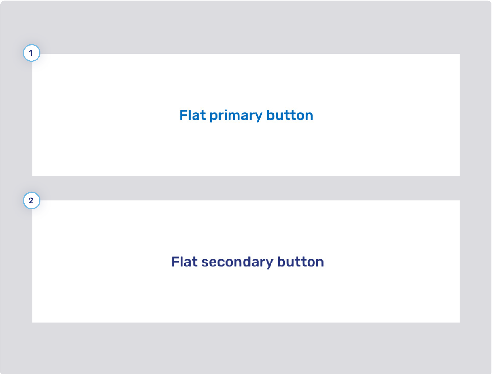
Flat primary and secondary buttons
-
Flat primary button style
-
Background states
-
Border width
-
Border states
-
Foreground states
-
-
Flat secondary button style
-
Background states
-
Border width
-
Border states
-
Foreground states
-
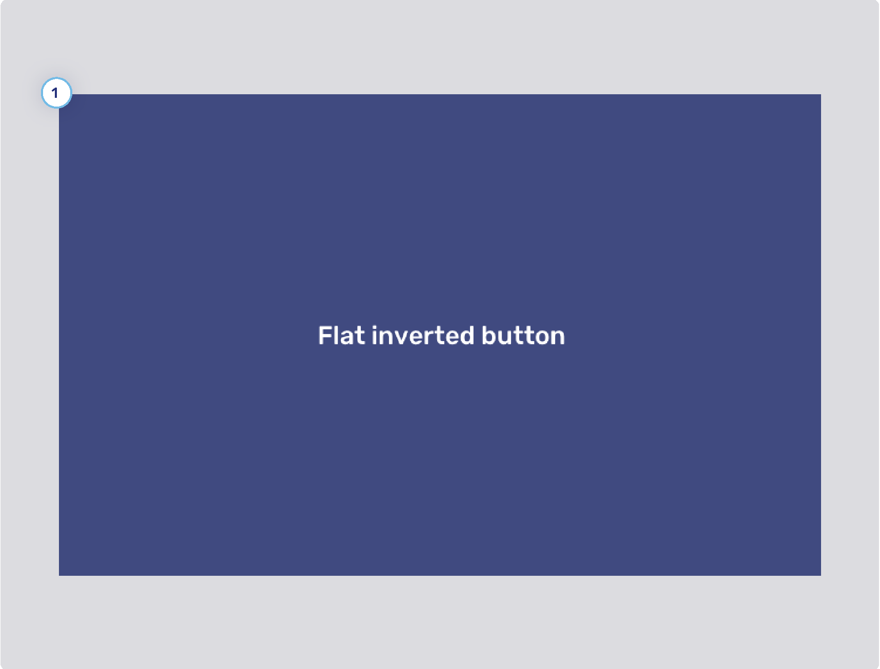
Flat inverted buttons
-
Background states
-
Border width
-
Border states
-
Foreground states
Toggle buttons
-
Background states
-
Border width
-
Border states
-
Foreground states
Flat toggle buttons
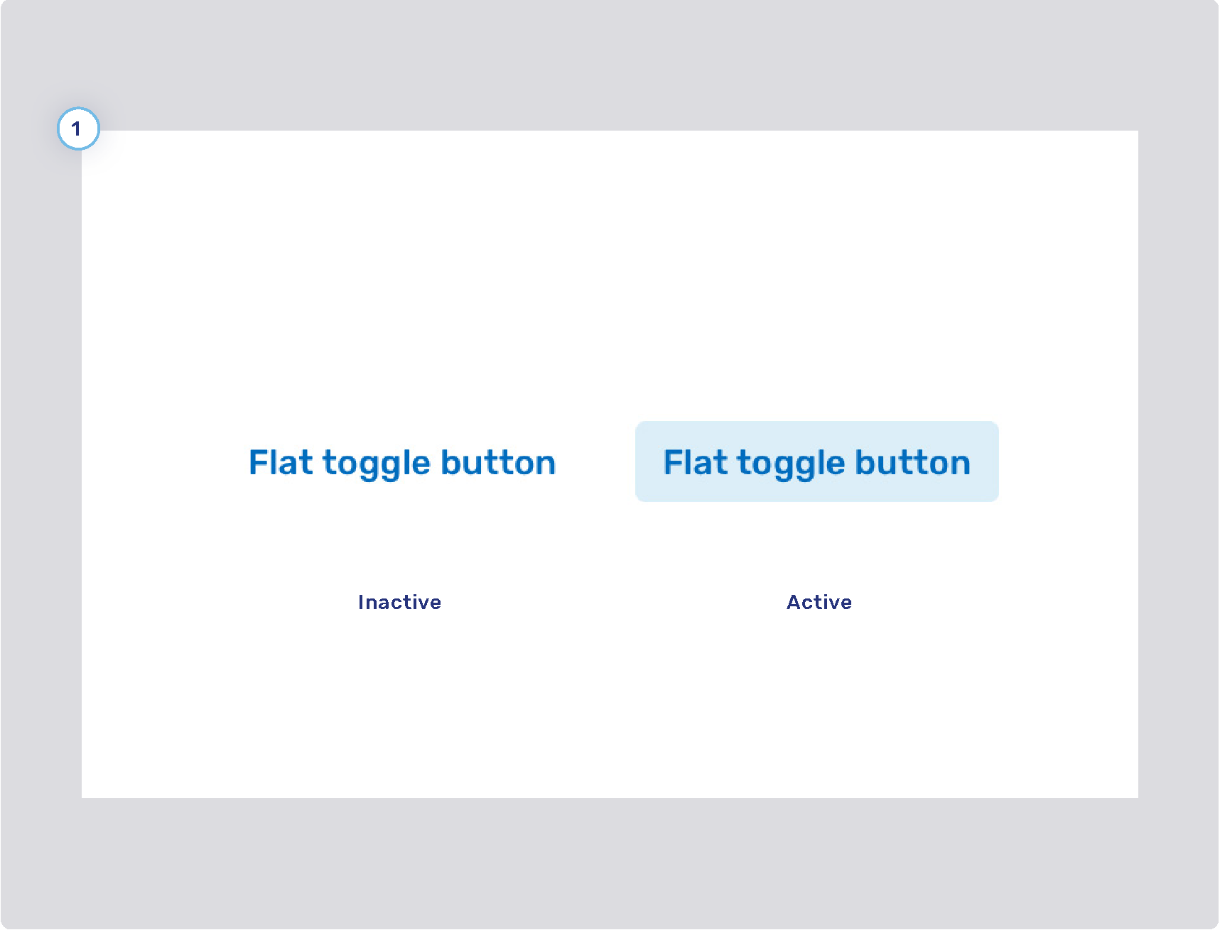
-
Background states
-
Border width
-
Border states
-
Foreground states
Conversation theming
The configuration properties listed here affect the conversation panel in the following Unblu UIs:
-
The Agent Desk
-
The Floating Visitor UI
-
The Embedded Visitor UI
-
The Single Conversation Desk
-
The Visitor Desk
Conversation control elements
-
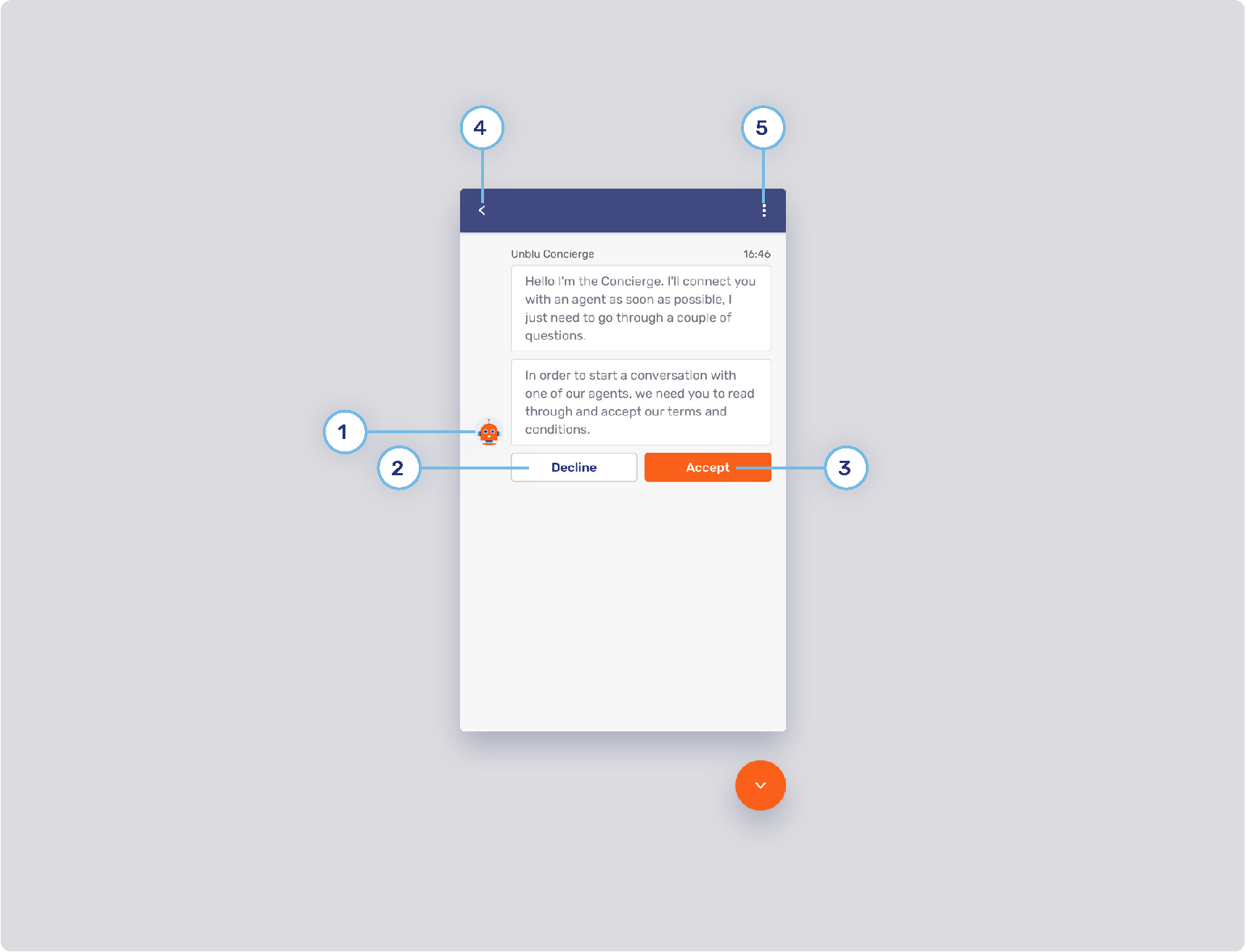
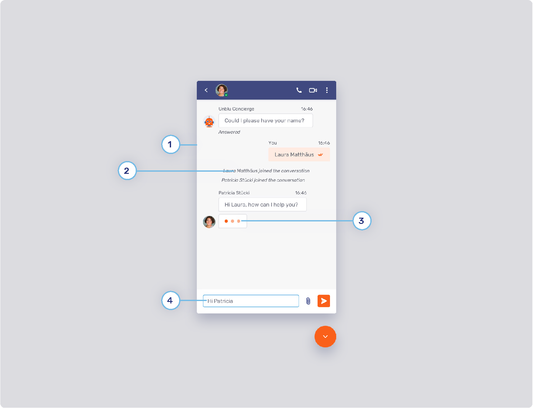
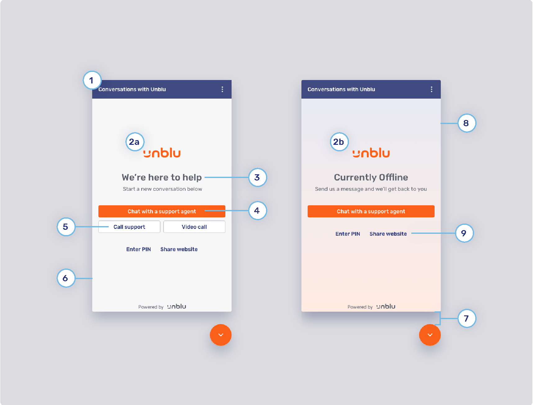
Unblu Concierge
Refer to Concierge person for information on changing the name and avatar of the concierge.
-
Secondary button style
Refer to Primary and secondary buttons.
-
Primary button style
Refer to Primary and secondary buttons.
-
Back button
The configuration property com.unblu.visitor.ui.pinentry.allowBack determines whether the visitor’s chat action bar should contain the back button
 , which lets them return to the conversation overview.
 -
Flat inverted button
Refer to Flat inverted buttons
Conversation panel appearance
-
Chat background
-
System messages
-
Background
-
com.unblu.conversation.messaging.ui.colorSystemMsgBackground
-
com.unblu.conversation.messaging.ui.colorSystemInternalMsgBackground
-
com.unblu.conversation.messaging.ui.colorSystemMsgBackgroundHovered
-
com.unblu.conversation.messaging.ui.colorSystemInternalMsgBackgroundHovered
-
com.unblu.conversation.messaging.ui.colorSystemMsgBackgroundPressed
-
com.unblu.conversation.messaging.ui.colorSystemInternalMsgBackgroundPressed
-
-
Border
-
Text
-
-
Typing indicator color
-
Thinking indicator
-
Avatar
-
Background and border
-
Text
-
Text animation
-
com.unblu.conversation.messaging.ui.thinkingIndicatorAnimationStartDelay
-
com.unblu.conversation.messaging.ui.thinkingIndicatorCharacterAnimationDelay
-
com.unblu.conversation.messaging.ui.thinkingIndicatorCharacterFadeDuration
-
com.unblu.conversation.messaging.ui.thinkingIndicatorWaveDuration
-
com.unblu.conversation.messaging.ui.thinkingIndicatorWaveBrightStart
-
com.unblu.conversation.messaging.ui.thinkingIndicatorWaveBrightEnd
-
com.unblu.conversation.messaging.ui.thinkingIndicatorWaveDimOpacity
-
-
-
Message input
-
Avatar position
-
Background
-
Border
-
com.unblu.conversation.messaging.ui.internalMessageInputBorderColor
-
com.unblu.conversation.messaging.ui.messageInputBorderColorNonEmpty
-
com.unblu.conversation.messaging.ui.internalMessageInputBorderColorNonEmpty
-
com.unblu.conversation.messaging.ui.messageInputBorderColorFocus
-
com.unblu.conversation.messaging.ui.internalMessageInputBorderColorFocus
-
com.unblu.conversation.messaging.ui.messageInputBorderColorError
-
com.unblu.conversation.messaging.ui.internalMessageInputBorderColorError
-
Text
-
Send button
To replace the icon on the Send button, refer to Enterprise UX Kit. You can influence the button’s appearance with the following properties.
-
Background
-
Border
-
com.unblu.conversation.messaging.ui.send_internal_message_button.borderWidth
-
com.unblu.conversation.messaging.ui.send_internal_message_button.borderNormal
-
com.unblu.conversation.messaging.ui.send_internal_message_button.borderHover
-
com.unblu.conversation.messaging.ui.send_internal_message_button.borderPress
-
-
Foreground
Chat message theming
You can customize the appearance of both public message (visible to all participants) and internal messages (visible only to participating agents).
-
Message header
-
My messages
These are messages sent by the person viewing the conversation panel.
-
Background
-
Border
-
Text
-
State tick color
-
-
Other messages
These are messages sent by other participants in the conversation.
-
Avatar position
-
Links
Replies to individual messages
-
Text input field
-
Replies in the conversation timeline
Internal messages
Internal message headers
-
com.unblu.conversation.messaging.ui.textColorInternalMsgHeader
-
com.unblu.conversation.messaging.ui.textSizeInternalMsgHeader
-
com.unblu.conversation.messaging.ui.colorInternalMsgStateTick
-
com.unblu.conversation.messaging.ui.colorInternalMsgStateTickUnread
-
My internal messages
-
-
com.unblu.conversation.messaging.ui.colorMyInternalMsgBackground
-
com.unblu.conversation.messaging.ui.colorMyInternalMsgBorder
-
com.unblu.conversation.messaging.ui.textColorMyInternalMsgBody
-
com.unblu.conversation.messaging.ui.textSizeMyInternalMsgBody
-
Other internal messages
-
-
com.unblu.conversation.messaging.ui.colorOtherInternalMsgBackground
-
com.unblu.conversation.messaging.ui.colorOtherInternalMsgBorder
-
com.unblu.conversation.messaging.ui.textColorOtherInternalMsgBody
-
com.unblu.conversation.messaging.ui.textSizeOtherInternalMsgBody
-
com.unblu.conversation.messaging.ui.textColorOtherInternalMsgLink
Internal replies in the conversation timeline
-
com.unblu.conversation.messaging.ui.colorMyInternalMsgReplyBackground
-
com.unblu.conversation.messaging.ui.textColorReplyingToInternalMsgInput
-
com.unblu.conversation.messaging.ui.colorOtherInternalMsgReplyBackground
-
com.unblu.conversation.messaging.ui.textColorMyInternalMsgReply
-
com.unblu.conversation.messaging.ui.textColorOtherInternalMsgReply
-
Internal message input field
-
-
Border
-
Divider
-
Background
-
Border
-
com.unblu.conversation.messaging.ui.send_internal_message_button.borderWidth
-
com.unblu.conversation.messaging.ui.send_internal_message_button.borderNormal
-
com.unblu.conversation.messaging.ui.send_internal_message_button.borderHover
-
com.unblu.conversation.messaging.ui.send_internal_message_button.borderPress
-
-
Foreground
Video and voice chat conversation panel
The settings in this section affect both agent and visitor UIs.
Before answering the call
-
Call background
-
Accept button color
-
Decline button color
-
Call action button style
-
Radius
-
Background
-
Border
-
Icon
-
-
Call type background
-
Call links
During the call
-
Call toggle button style
-
Background
-
Border
-
Icon
-
-
Minimized video dimensions
-
Informational UI elements
-
com.unblu.conversation.call.unmuteAudioPlaybackOverlayBackground
-
com.unblu.conversation.call.colorMobilePiPBackground
-
Action bar style
-
Closed captions
Picture-in-picture (PiP)
The configuration properties in this section also apply to PiP in the Unblu mobile SDKs.
Visitor UI theming
The configuration properties listed here affect the Unblu visitor UIs:
-
The Floating Visitor UI
-
The Embedded Visitor UI
-
The Visitor Desk
Some of the configuration properties don’t affect all visitor UIs. For example, only the Floating Visitor UI has a launcher button, so the launcher button configuration properties only affect that UI.
Launcher button
-
Launcher button
-
Display mode
-
Button labels and tooltips
The button label text for the launcher button depends on the button’s state. If the launcher button style is set to
ICON, the label text is displayed as a tooltip, provided tooltips are enabled for the launcher button. -
Icon
-
com.unblu.siteintegration.ui.launcherButtonClosedIcon
This configuration property only affects the icon when the Floating Visitor UI is closed. For information on replacing icons, refer to Enterprise UX Kit.
-
States
-
Border
-
Text
-
-
Launcher button notification badge
Engagement UI
-
Action bar
-
Floating Visitor UI
-
Embedded Visitor UI
-
Visitor Desk
-
-
Displayed logo
-
Font
-
Primary button
Refer to Primary and secondary buttons
-
Secondary button
Refer to Primary and secondary buttons
-
Online background color
-
Offline background gradient color
-
Spacing
-
Flat secondary button
Refer to Flat primary and secondary buttons.
Meeting UI
-
com.unblu.visitor.conversation.ui.meetingUiActionBarBackgroundAngle
-
com.unblu.visitor.conversation.ui.meetingUiActionBarBackgroundColors
-
com.unblu.visitor.conversation.ui.meetingUiActionBarDividerColor
-
com.unblu.visitor.conversation.ui.meetingUiActionBarElevation
-
com.unblu.visitor.conversation.ui.meetingUiActionBarForeground
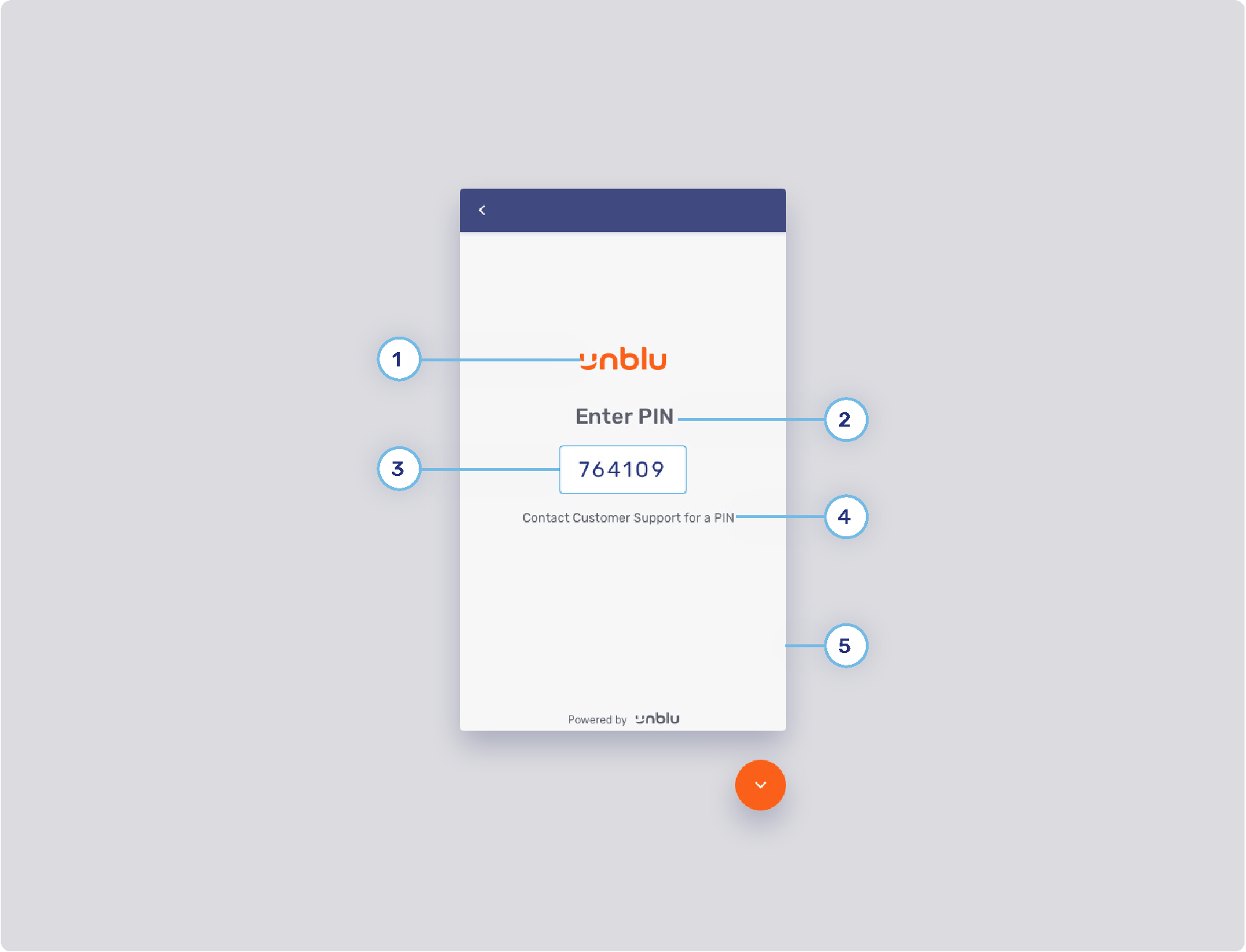
PIN entry panel
-
PIN UI logo
-
Header text
-
Input field style
-
Background color: com.unblu.theme.input.backgroundColor
-
Standard border color: com.unblu.theme.input.borderColor
-
Focus border color: com.unblu.theme.input.borderColorFocus
-
Error border color: com.unblu.theme.input.borderColorError
-
Valid border color: com.unblu.theme.input.borderColorValid
-
Text
-
-
Body text
-
PIN UI background
-
Other
-
com.unblu.visitor.ui.pinentry.allowBack determines whether the action bar of the PIN entry panel should contain the back button
.
-
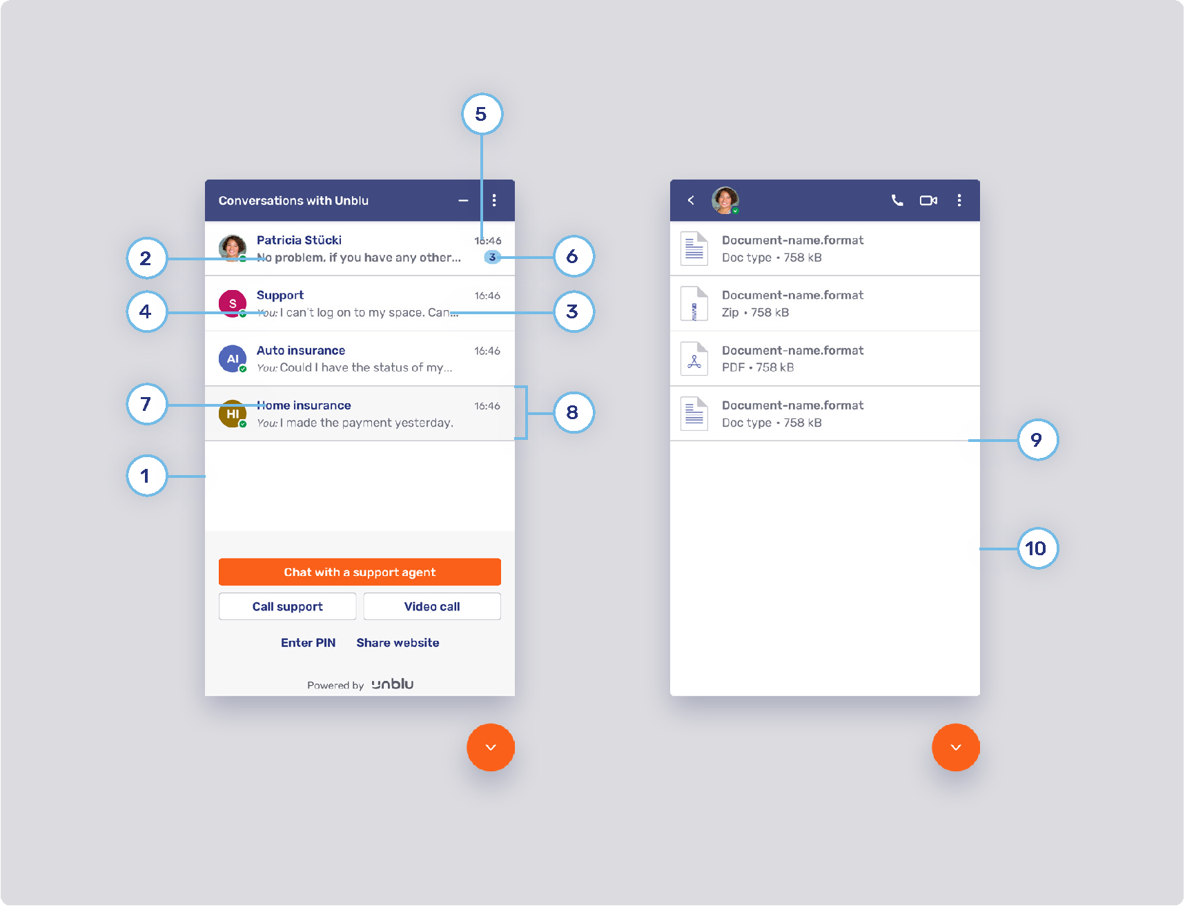
Conversation inbox and file panels
-
Conversation list background
-
Last unread message
-
Last read message
-
Sender’s label style
-
Last message time style
-
Notification badge
-
Title style
-
List item state
-
Divider
-
File list background color
Collaboration space
Splash screen
-
Loading splash screen
-
Loading splash screen icon
-
Loading splash screen text color
-
Loader color
Collaboration space control bar
-
Visitor layer menu button
-
Background states
-
com.unblu.visitor.conversation.ui.layercontrols.menubutton.backgroundNormal
-
com.unblu.visitor.conversation.ui.layercontrols.menubutton.backgroundNormalActive
-
com.unblu.visitor.conversation.ui.layercontrols.menubutton.backgroundHover
-
com.unblu.visitor.conversation.ui.layercontrols.menubutton.backgroundHoverActive
-
com.unblu.visitor.conversation.ui.layercontrols.menubutton.backgroundPress
-
com.unblu.visitor.conversation.ui.layercontrols.menubutton.backgroundPressActive
-
-
Border width: com.unblu.visitor.conversation.ui.layercontrols.menubutton.borderWidth
-
Border states
-
com.unblu.visitor.conversation.ui.layercontrols.menubutton.borderNormal
-
com.unblu.visitor.conversation.ui.layercontrols.menubutton.borderNormalActive
-
com.unblu.visitor.conversation.ui.layercontrols.menubutton.borderHover
-
com.unblu.visitor.conversation.ui.layercontrols.menubutton.borderHoverActive
-
com.unblu.visitor.conversation.ui.layercontrols.menubutton.borderPress
-
com.unblu.visitor.conversation.ui.layercontrols.menubutton.borderPressActive
-
-
Foreground states
-
com.unblu.visitor.conversation.ui.layercontrols.menubutton.foregroundNormal
-
com.unblu.visitor.conversation.ui.layercontrols.menubutton.foregroundNormalActive
-
com.unblu.visitor.conversation.ui.layercontrols.menubutton.foregroundHover
-
com.unblu.visitor.conversation.ui.layercontrols.menubutton.foregroundHoverActive
-
com.unblu.visitor.conversation.ui.layercontrols.menubutton.foregroundPress
-
com.unblu.visitor.conversation.ui.layercontrols.menubutton.foregroundPressActive
-
-
-
Layer action button
-
Background
-
com.unblu.conversation.collabspace.layer.action.backgroundNormal
-
com.unblu.conversation.collabspace.layer.action.backgroundNormalActive
-
com.unblu.conversation.collabspace.layer.action.backgroundHover
-
com.unblu.conversation.collabspace.layer.action.backgroundHoverActive
-
com.unblu.conversation.collabspace.layer.action.backgroundPress
-
com.unblu.conversation.collabspace.layer.action.backgroundPressActive
-
-
Border width
-
Border width
-
Foreground
-
com.unblu.conversation.collabspace.layer.action.foregroundNormal
-
com.unblu.conversation.collabspace.layer.action.foregroundNormalActive
-
com.unblu.conversation.collabspace.layer.action.foregroundHover
-
com.unblu.conversation.collabspace.layer.action.foregroundHoverActive
-
com.unblu.conversation.collabspace.layer.action.foregroundPress
-
com.unblu.conversation.collabspace.layer.action.foregroundPressActive
-
-
Other collaboration space UI elements
-
Capturing frame
-
Click feedback animation
-
Secondary color map
These are colors used for secondary elements such as avatars and virtual mouse cursor labels. The colors are chosen randomly from those defined in com.unblu.theme.color.secondaryColorMap. For more information, refer to Feedback colors and secondary color map.
Mobile collaboration space
-
Visitor layer menu
Refer to Collaboration space control bar.
-
Layer control toggle button
-
Background states
-
Border width
-
Border radius
-
Foreground states
-
Agent UI theming
There are two primary user interfaces for agents:
-
The Agent Desk
-
The Single Conversation Desk
General agent UI theming
The configuration properties in the sections below affect both the Agent Desk and the Single Conversation Desk.
Notification toasts
-
Notification toasts
-
Destination
-
Alignment
-
Timeout
-
Maximum number
-
Request icons
The icons on notification toasts are the same as the ones used in the queue; refer to Request icons below. For information on replacing icons, refer to Enterprise UX Kit.
-
Colors
-
Bot threads
-
Bot thread line
-
Bot thread line width: com.unblu.conversation.messaging.ui.botThreadLineWidth
-
Bot thread line color: com.unblu.conversation.messaging.ui.colorBotThreadLine
-
-
Bot thread status icon color
Agent collaboration space
Critical action button, flat inverted button, and marker color area
-
Critical primary button
-
Background states
-
Border width
-
Border states
-
Foreground
-
-
Critical secondary button
-
Background states
-
Border width
-
Border states
-
Foreground
-
-
Marker area color
Agent Desk
The configuration properties below only affect the Agent Desk.
Sidebar
-
Background color
-
Active highlight
-
Navigation buttons
-
Background states
-
Text states
-
Border width and radius
-
Border states
-
-
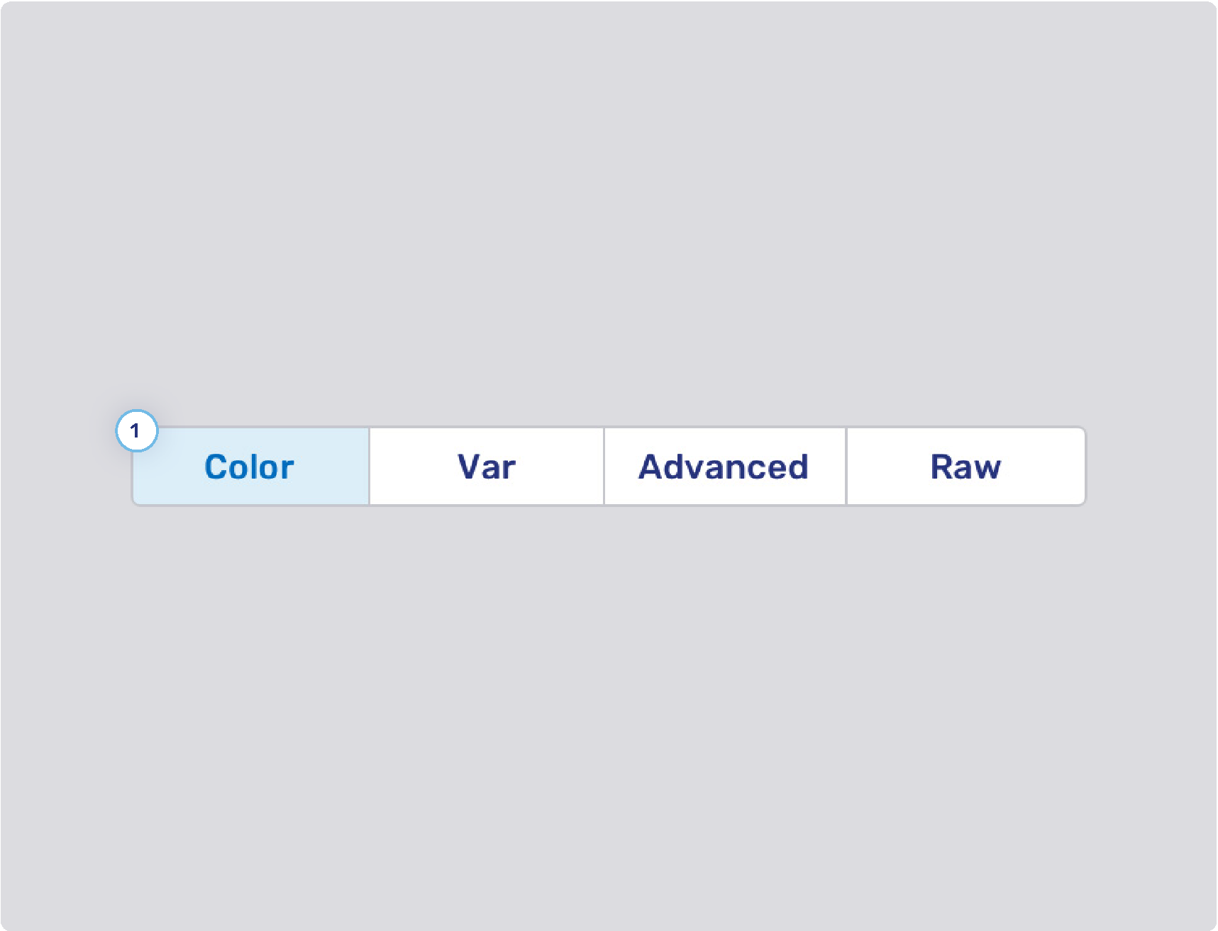
Dropdown select elements
The configuration properties below are used for the plus menu
 , the user menu and the overflow menu
  in the control bar.
-
Background states
-
Border width
-
Border states
-
Foreground states
-
Queue
-
Top bar button
-
Background states
-
Border states
-
Foreground
-
-
Flat primary button style
Refer to Flat primary and secondary buttons for other buttons theming.
-
You can define the background color of the request icons separately from the icons themselves:
-
Audio call: com.unblu.queue.ui.audioCallIconBackground
-
Co-browsing: com.unblu.queue.ui.cobrowsingIconBackground
-
External messenger: com.unblu.queue.ui.externalMessengerIconBackground
-
Forwarding: com.unblu.queue.ui.agentForwardingIconBackground
-
Invitation: com.unblu.queue.ui.agentInvitationIconBackground
-
Video call: com.unblu.queue.ui.videoCallIconBackground
The same icons and colors are used on the notification toasts for incoming requests. For information on replacing icons, refer to Enterprise UX Kit.
-
-
Icon display
-
Reserved badge
-
Background color: com.unblu.queue.ui.queueItemReservedLabelBackground
-
Inbox
-
Conversation tab style
-
Background states
-
Border width
-
Border states
-
Foreground states
-
Notification badge
-
Headless browser theming
The headless browser is used for universal co-browsing and server-based document collaboration. It has four default pages, each consisting of an image and some text. These text and configuration properties can be customized.
You can change the colors for all four pages:
Universal co-browsing "About" page
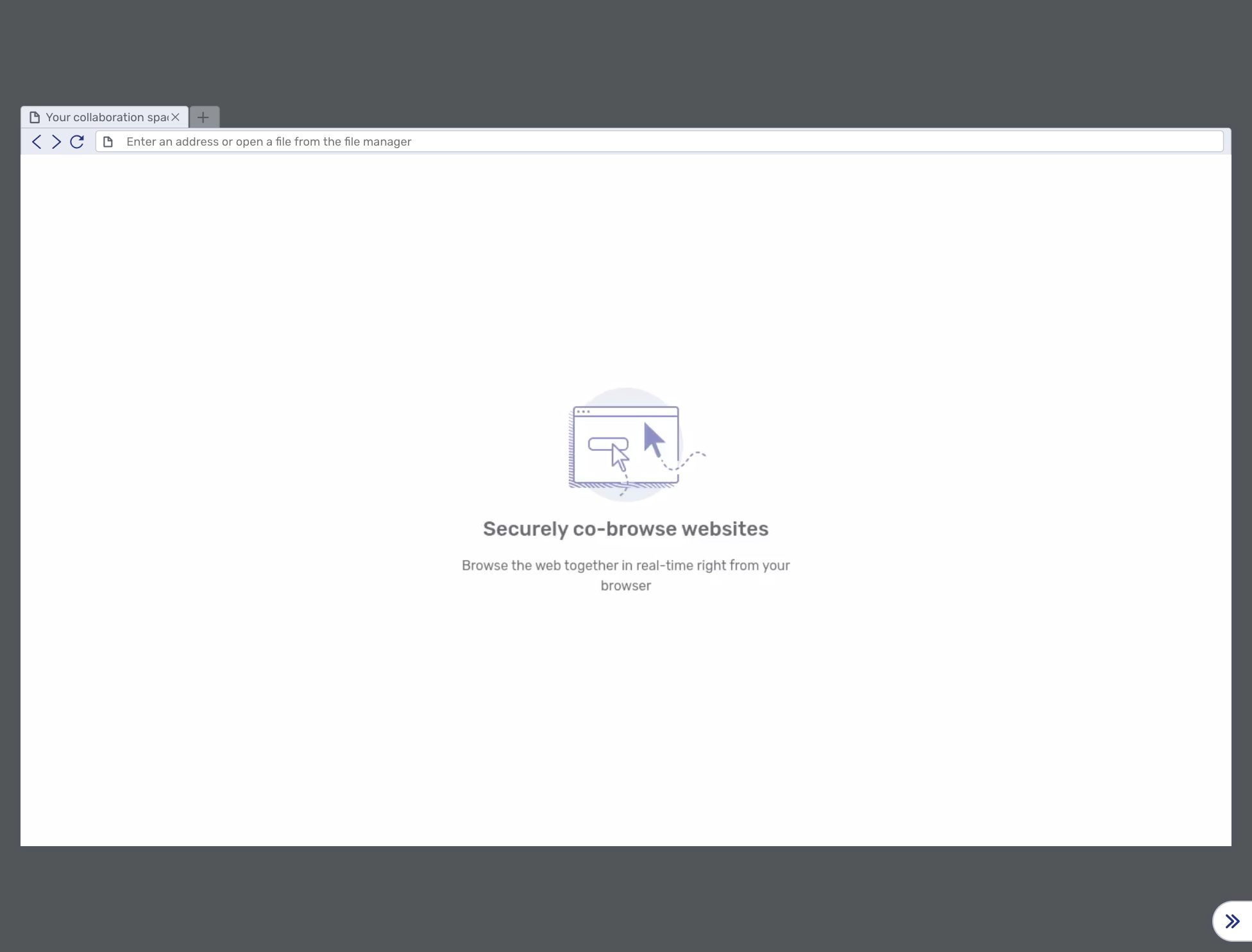
This landing page can be used for new "Websites" collaboration layers. The local URL to display this page is about:unblu.universal-cobrowsing.
You can change the default page with com.unblu.conversation.headless-browser.defaultNewWindowLocation.
The text items can be changed with:
-
com.unblu.hbworker.aboutpage.pageTitle (shared with the server-based document collaboration "about" page)
Server-based document collaboration "About" page
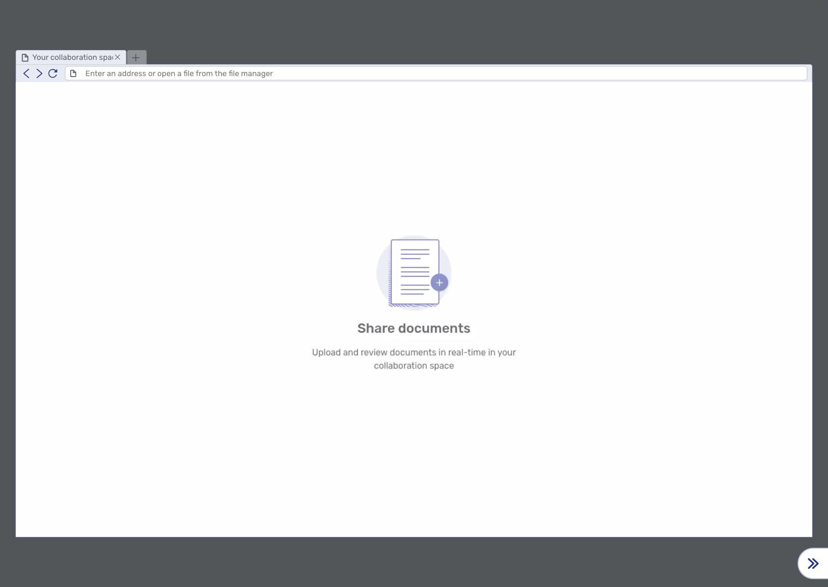
This landing page is used for new server-based "Documents" collaboration layers. The local URL to display this page is about:unblu.document-cobrowsing.
The text can be changed with:
-
com.unblu.hbworker.aboutpage.pageTitle (shared with the universal co-browsing "about" page)
Error page
The error page is displayed when an error occurs:
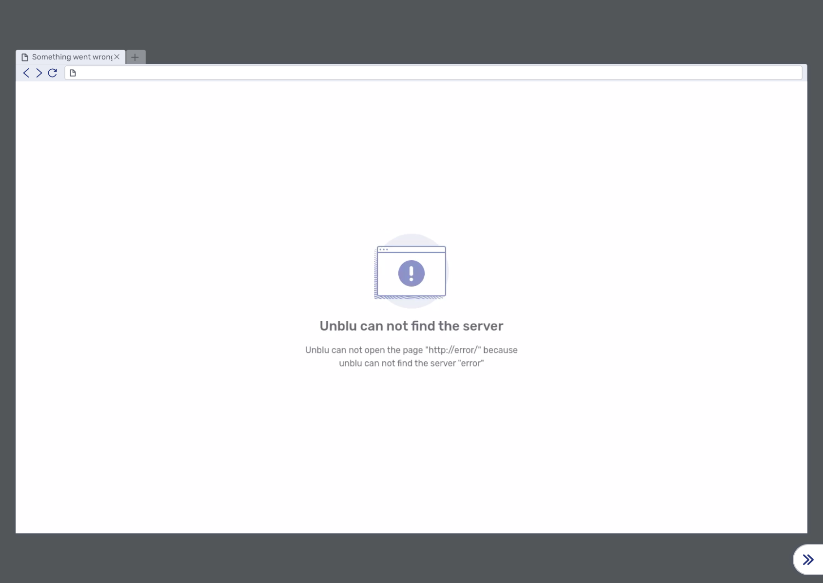
The text items can be changed with:
-
The error message displayed depends on the category of the error:
-
Network errors
-
Name not resolved (NotFound error)
-
Timeout
-
Other
-
-
HTTP error
-
Domain restriction errors
-
Access to local files not permitted
-
SSL is not permitted
-
No JavaScript permitted (URLs starting with
javascript:) -
Protocol (e.g.
ftp:) not permitted -
Request URL not permitted
-
-
SSL errors
-
Other errors
-
Native document collaboration viewer theming
General
-
com.unblu.documentcobrowsing.javascript.ui.documentPanelBackgroundColor
-
com.unblu.documentcobrowsing.javascript.ui.toolsHeaderBackground
-
com.unblu.documentcobrowsing.javascript.ui.tabsHeaderBackground
-
com.unblu.documentcobrowsing.javascript.ui.toolbarButtonBackgroundActive
-
com.unblu.documentcobrowsing.javascript.ui.presetsBackground
-
com.unblu.documentcobrowsing.javascript.ui.sidePanelsBackground
-
com.unblu.documentcobrowsing.javascript.ui.sidePanelsTextColor
Mobile theming
Mobile co-apping indicator
-
com.unblu.mobiledevice.indicator.cobrowsing.mobileCoBrowsingFrameWidth
-
com.unblu.mobiledevice.indicator.cobrowsing.mobileCoBrowsingFrameShadowSize
-
com.unblu.mobiledevice.indicator.cobrowsing.mobileCoBrowsingFrameShadowColor
-
com.unblu.mobiledevice.indicator.cobrowsing.mobileCoBrowsingIndicatorButtonIconColor
-
com.unblu.mobiledevice.indicator.cobrowsing.mobileCoBrowsingIndicatorButtonBackgroundColor
-
com.unblu.mobiledevice.indicator.cobrowsing.mobileCoBrowsingIndicatorBorderColor
-
com.unblu.mobiledevice.indicator.cobrowsing.mobileCoBrowsingIndicatorButtonShadowSize
-
com.unblu.mobiledevice.indicator.cobrowsing.mobileCoBrowsingIndicatorButtonShadowColor
-
com.unblu.mobiledevice.indicator.cobrowsing.mobileCoBrowsingIndicatorButtonInitialPosition
-
com.unblu.mobiledevice.indicator.cobrowsing.mobileCoBrowsingIndicatorButtonInitialHorizontalMargin
-
com.unblu.mobiledevice.indicator.cobrowsing.mobileCoBrowsingIndicatorButtonInitialVerticalMargin
-
com.unblu.mobiledevice.indicator.cobrowsing.mobileCoBrowsingPopUpMenuBackgroundColor
-
com.unblu.mobiledevice.indicator.cobrowsing.mobileCoBrowsingPopUpMenuTextColor
Branding
You can customize the Unblu on-premises product UI to fit your company’s corporate design by adding your own logos instead of the default Unblu logos. In the configuration property com.unblu.ui.branding.externalBrandResourcesUrl, add a URL that points to an unencrypted ZIP file containing the following files in the root of the archive:
-
favicon.ico -
logo.png -
logo_icon.png -
logo_inverse.png -
logo_pwa_192.png -
logo_pwa_512.png -
logo_pwa_vector.svg -
product_logo_icon.png -
call-dial-in-avatar.png -
call-video-background-replacement.png
If one of the files is missing, the Unblu defaults are used.
To reference a local file, use the file:// prefix. You can add authentication credentials like so: https://username:password@your.domain/path/to/zip/brand.zip
Make sure the temporary directory configured in your servlet container points to a folder that’s accessible by the application since the unzipped files are stored there. The relevant Java environment variable is java.io.tmpdir.
Check the server startup log if one of the files doesn’t behave as expected.
-
Favicon
This file is used as the favicon in the browser. It’s typically displayed on the page’s tab and in the bookmarks.
-
File name:
favicon -
File extension:
.ico -
Max size: 100 KB
-
Default:

-
-
Logo
The logo image is displayed on the login, the loading, and the error page.
-
File name:
logo -
File extension:
.png -
Max size: 500 KB
-
Min width: 50 px
-
Max width: 300 px
-
Min height: 50 px
-
Max height: 144 px
-
Default:

-
-
Logo icon
The logo icon is displayed on the right side of the agent tab bar (top bar in the Agent Desk). The logo icon is also used for web notifications (notifications displayed by the browser).
-
File name:
logo_icon -
File extension:
.png -
Max size: 100 KB
-
Min width: 46 px
-
Max width: 96 px
-
Min height: 46 px
-
Max height: 46 px
-
Default:

-
-
Inverse logo
The inverse logo is displayed at the top of the navigation menu and any other location where the logo appears on a dark background, such as the brand background color, or in a UI rendered in dark mode.
-
File name:
logo_inverse -
File extension:
.png -
Max size: 500 KB
-
Min width: 50 px
-
Max width: 300 px
-
Min height: 50 px
-
Max height: 144 px
-
-
Progressive web app logos
The progressive web app logos are used if you install the Agent Desk as a progressive web app (PWA).
-
Progressive web app logo, 192x192 px
-
File name:
logo_pwa_192 -
File extension:
.png -
Max size: N/A
-
Min width: 192 px
-
Max width: 192 px
-
Min height: 192 px
-
Max height: 192 px
-
Default:

-
-
Progressive web app logo 512x512 px
-
File name:
logo_pwa_512 -
File extension:
.png -
Max size: N/A
-
Min width: 512 px
-
Max width: 512 px
-
Min height: 512 px
-
Max height: 512 px
-
-
Progressive web app logo (SVG format)
-
File name:
logo_pwa_vector -
File extension:
.svg -
Max size: 500 KB
-
Min width: N/A
-
Max width: N/A
-
Min height: N/A
-
Max height: N/A
-
-
-
Product logo icon
The product logo icon is used for web notifications and other places where you need the Unblu logo as an icon.
-
File name:
product_logo_icon -
File extension:
.png -
Max size: 100 KB
-
Min width: 46 px
-
Max width: 96 px
-
Min height: 46 px
-
Max height: 46 px
-
Default:

-
-
Call dial-in avatar
The call dial-in avatar is used for participants who have dialed in to a call with a normal phone.
-
File name:
call-dial-in-avatar -
File extension:
.png -
Max size: 500 KB
-
Min width: 48 px
-
Max width: 500 px
-
Min height: 48 px
-
Max height: 500 px
-
Default:

-
-
Video call background replacement
The video call background replacement image serves as the background replacement in video calls if the com.unblu.conversation.call.background.replacementImageSource is set to
BRANDING_RESOURCES.-
File name:
call-video-background-replacement -
File extension:
.png -
Max size: 1000 KB
-
Min width: 400 px
-
Max width: 1920 px
-
Min height: 600 px
-
Max height: 1200 px
-
Visitor Desk brand logo
When com.unblu.visitordesk.ui.admission.logo is set to BRAND_LOGO or BRAND_LOGO_INVERSE, the width of the logo displayed at the top of the "Request admission", "Waiting room", and "Conversation ended" pages in the Visitor Desk can be configured using com.unblu.visitordesk.ui.admission.logoWidth. The height is adjusted automatically to preserve the aspect ratio of the logo.
Logos in dark mode
When a UI renders in dark mode, Unblu uses the inverse logo by default so that it remains legible on the dark background. You can specify which logo to display in dark mode for the following:
-
"Conversation closed" page: com.unblu.desk.conversation.closed.logoDark
-
Engagement UI when agents are available to chat: com.unblu.visitor.ui.engagement.agentAvailableLogoDarkMode
-
Engagement UI when no agents are available to chat: com.unblu.visitor.ui.engagement.agentAwayLogoDarkMode
-
Visitor Desk admission pages ("Request admission", "Waiting room", and "Conversation ended"): com.unblu.visitordesk.ui.admission.logoDark
Each of these properties defaults to BRAND_LOGO_INVERSE, the inverse logo from your brand resources. If your brand resources don’t include an inverse logo, add one so that it displays with good contrast in dark mode.
See also
-
For information on customizing individual icons throughout the Unblu UIs, refer to Enterprise UX Kit.
-
For information on light and dark color modes, refer to Color mode.
Enterprise UX Kit
The Enterprise UX Kit provides additional theming, branding, and integration options for the Unblu UI. It lets you replace individual icons with custom SVGs and customize loading animations with custom animated SVGs.
The Enterprise UX Kit is available since Unblu 8.24.0.
| The Enterprise UX Kit is a separately licensed feature of Unblu. The icon configuration properties are only visible and editable in the Account Configuration interface with a valid license. |
Custom icons
With the Enterprise UX Kit, the icons and loading animations used in Unblu UIs are available as configuration properties in the Account and Global Server Configuration interfaces.
-
The icon configuration properties are available in the scopes
GLOBAL,ACCOUNT,AREA,TEAM,USER, andAPIKEY. This means you can configure different icon sets for different contexts, such as mobile integrations, named areas, or teams. -
The keys of the icons' configuration properties all begin with
com.unblu.theme.icons.*. -
Each icon must be specified as an SVG
<symbol>. No other image formats are supported.
Custom loading animations
Loading animations can be customized using the same SVG symbol approach as icons. To create a custom loading animation, provide an SVG <symbol> element that includes embedded SVG animations such as <animate> or <animateTransform> elements.
SVG symbol format
The SVG <symbol> element for an icon must meet the following requirements:
-
The
idattribute must match the ID specified in the description of the icon’s configuration property and used in the default icon. -
The
<symbol>element must include theviewBoxattribute. The default icons use a view box of0 0 20 20. -
Any custom loading animations must be embedded directly in the SVG. CSS animations are not supported.
The following example shows the default value of the add-circle-filled icon:
<symbol id="x-unblu-icon-add-circle-filled" viewBox="0 0 20 20">
  <path fill-rule="evenodd"
    d="M10 2a8 8 0 1 0 0 16 8 8 0 0 0 0-16m0 3a.75.75 0 0 1
       .75.75v3.5h3.5a.75.75 0 0 1 0 1.5h-3.5v3.5a.75.75 0 0
       1-1.5 0v-3.5h-3.5a.75.75 0 0 1 0-1.5h3.5v-3.5A.75.75
       0 0 1 10 5"
    clip-rule="evenodd"/>
</symbol>
To replace this icon, provide your own SVG <symbol> element with the same id value (x-unblu-icon-add-circle-filled) in the configuration property com.unblu.theme.icons.addCircleFilledSymbol.
The icon editor
The configuration interfaces include a built-in icon editor with the following features:
-
Upload an SVG file
-
Remove colors so the icon inherits the theme colors
-
Preview the icon, both alone and on buttons
-
Edit the raw SVG markup
To access the icon editor, open the configuration property that defines the icon in the Account Configuration interface and click the preview of the current icon.
See also
-
For more information on theming Unblu UIs, refer to UI theming cheat sheets.
-
For more information on branding the Unblu UIs, refer to Branding.
-
For information on other ways to customize the Unblu UIs, refer to the UI customization guide.