Embedded Visitor UI guide
The Embedded Visitor UI provides a way of integrating Unblu into your website or single-page application (SPA) so that messaging remains the main focus and content.
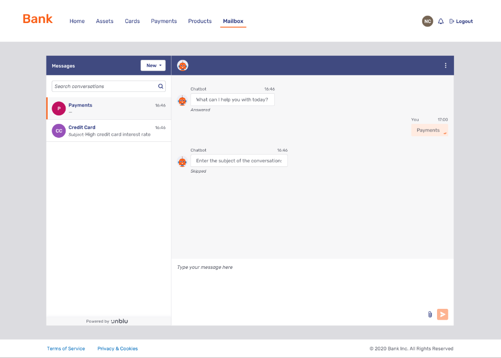
To add the Embedded Visitor UI to a page, Unblu provides a custom HTML element, <unblu-embedded-app>. The custom element has attributes for various configuration properties, such as the API key or the named area. You can place it anywhere on a page and size it any way you like to integrate seamlessly with your UI.
Embedded vs Floating Visitor UI
The Embedded Visitor UI is best suited to situations where the focus is on messaging. It provides a familiar email-like experience for visitors with plenty of space for longer form texts.
Like the Floating Visitor UI, you may customize the Embedded Visitor UI to suit your requirements in terms of branding and functionality available. However, the Embedded Visitor UI is directly embedded into your website, with no floating overlay. The size and position of the Unblu component are defined by the website, not using configuration properties, but dynamically using the website CSS.
The Floating Visitor UI is best suited to providing in-context assistance because it takes up less of the screen. The Floating Visitor UI can also be more easily added to any page.
You can use both the Floating Visitor UI and the Embedded Visitor UI on your website. You can even make both visitor UIs available in the same location. However, note that switching between the two visitor UIs deinitializes and reinitializes Unblu, resulting in an interruption of any ongoing calls or collaboration sessions.
View modes
The Embedded Visitor UI offers two different view modes, split view mode and single view mode.
Unblu can be configured to switch between split view mode and single view mode automatically based on the width of the embedded UI element.
Depending on the view mode, the content displayed to visitors varies.
- Split view mode
-
In split view mode, the Embedded Visitor UI displays a sidebar on the left of the UI.
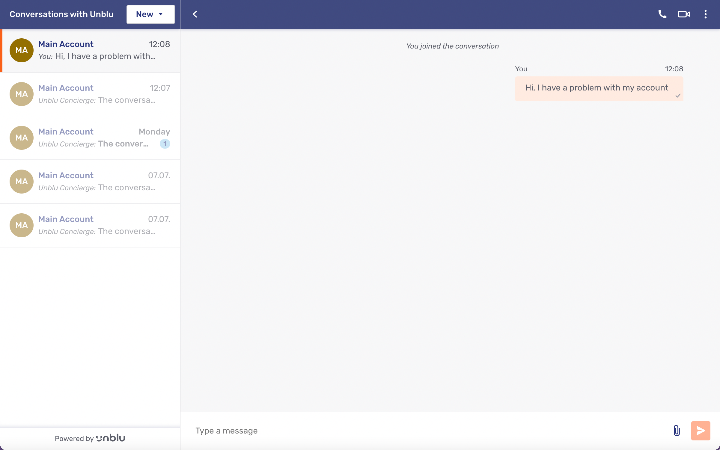
The sidebar contains a list of the visitor’s conversations in chronological order (most recent at the top) and a button to start or join conversations. If no conversations exist yet, the conversation panel on the left is empty.
Content is displayed on the right: either the selected conversation or the engagement area.
- Single view mode
-
In single view mode, either the conversation list or a selected conversation is displayed in the whole screen.
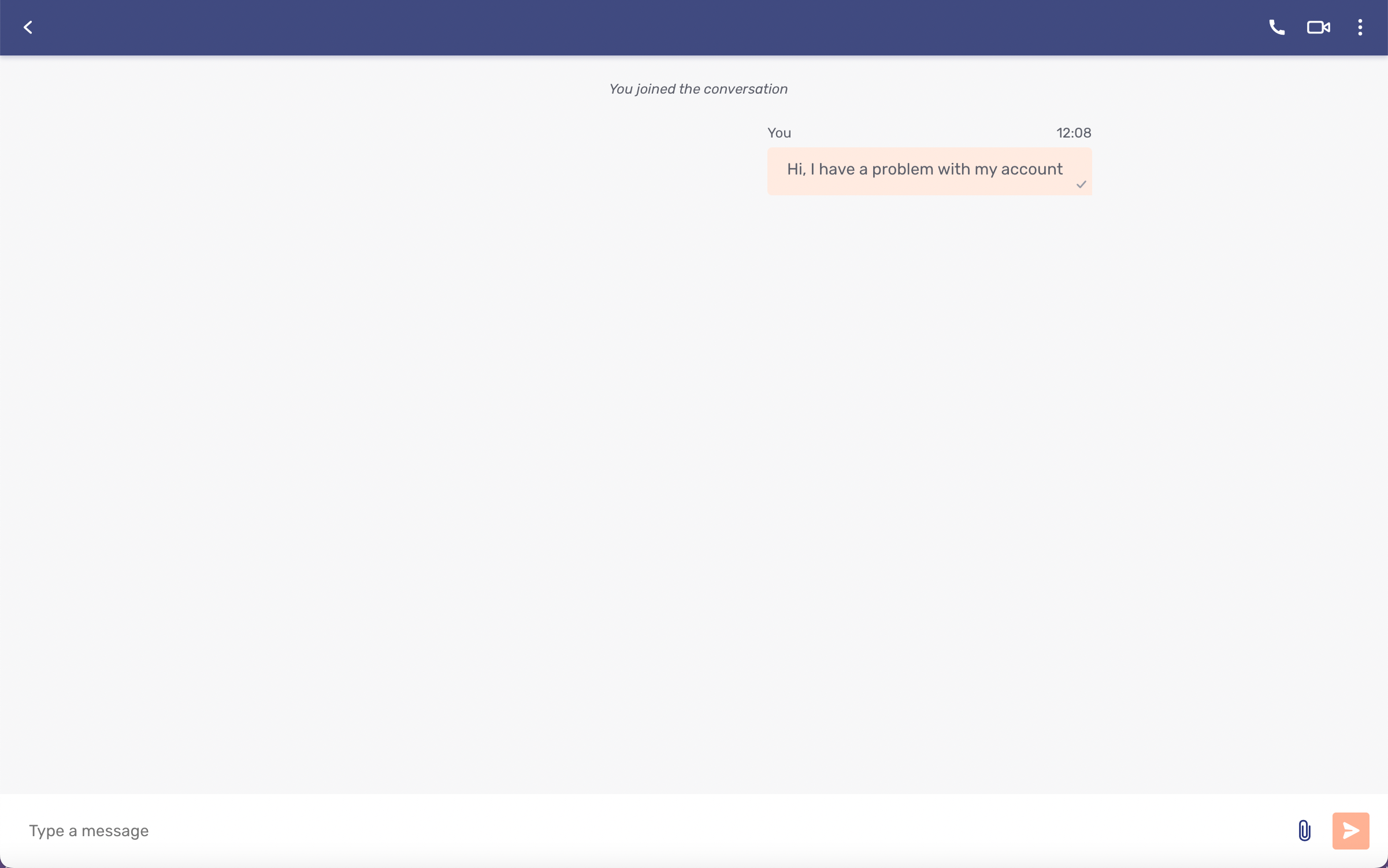
The conversation list and the button to start a new conversation are displayed in a separate view from the current conversation, accessible via the back button
 in the action bar.
Action bar
The action bar is available in both split and single views.
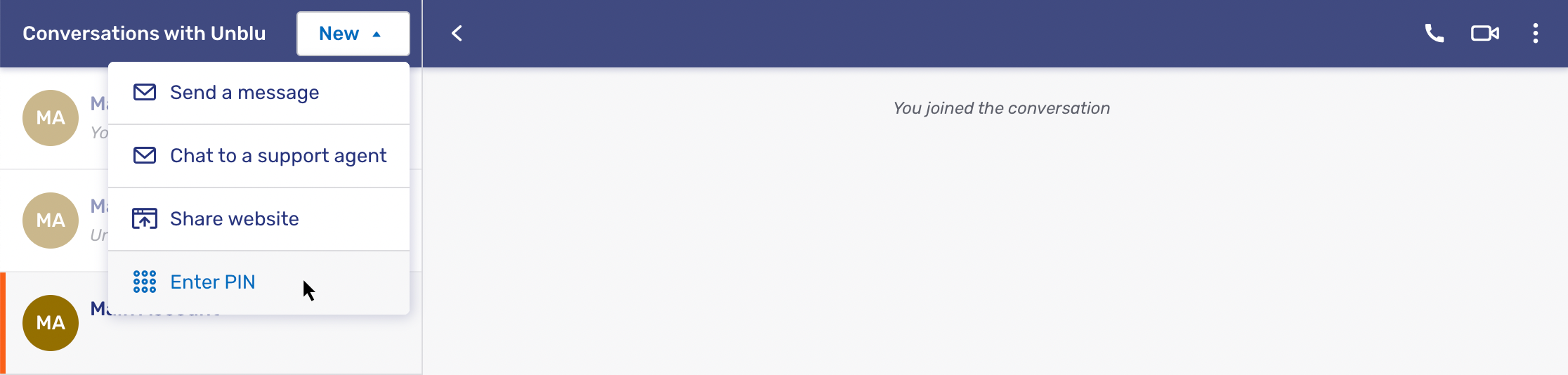
Visitors can start available interactions from the dropdown menu located in the action bar at the top of the page.
The label of the action bar and the label of the engagement button are configurable.
Search
If full-text search is enabled, visitors can search the text of the messages in all the conversations they take part in. They can’t search for participants or conversation topics.
The search icon  is in the action bar above the conversation list, to the left of the button to start a new conversation.
Clicking the search icon replaces the conversation list with the search screen. In split view mode, the content on the right is unaffected, so the conversation a visitor is reading stays open.
Visitors run a search by entering a search term and pressing Enter or clicking the search icon beside the input field. The Clear button empties the input field and discards the results.
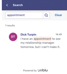
The search engine ranks the results by how closely they match the search term. Each result shows the sender’s avatar and display name, the time the message was sent, and up to two extracts from the message. Within the extracts, the words matching the search term are highlighted in color. More results load as visitors scroll to the end of the list.
Clicking a result opens the conversation the message belongs to. The selected result is marked in the same way as the active conversation in the conversation list.
The back button on the search screen returns visitors to the conversation list and discards the search term and results.
Collaboration layers
When a collaboration layer is started, the UI switches to full screen to display the collaboration space over the whole browser.
The conversation is moved to a collapsible chat panel on the right side.
Calls
When a call is started in split view mode, the conversation is hidden when the call screen is shown and vice versa. Visitors can toggle between the conversation and the call using the  button at the top of the screen.
If a visitor tries to navigate to another conversation during the call, a message appears warning them that they must end the call first.
In single view mode, the conversation list is hidden during a call. Visitors can only toggle between the conversation panel and the call.
For more information about the different call controls available, refer to Floating Visitor UI call view controls.
Integration
Two features of the Mozilla Web Component standard are used in the embedded UI:
-
Custom HTML elements are used to register a custom HTML element tag. The custom elements code is then called every time the tag is used.
-
Internally, the element uses shadow DOM to have a separate styling space.
Unblu provides the web component containing the Embedded Visitor UI, including the collaboration space. It’s configurable via the exposed attributes and JS API.
For information on how to integrate the Embedded Visitor UI into your website or SPA, refer to the Embedded JS API reference.
Color scheme
The color scheme of the Embedded Visitor UI is defined by com.unblu.si.embedded.ui.colorScheme, which takes the value light, dark, or auto:
-
A value of
lightordarkfixes the Embedded Visitor UI to that color scheme, regardless of the embedding page. -
A value of
automakes the Embedded Visitor UI follow the color scheme of the embedding page.
For information on controlling the embedding page’s color scheme, refer to the color scheme section of the Floating Visitor UI integration article.
Embedded Visitor UI configuration properties
You can configure the appearance of the Embedded Visitor UI with the following configuration properties:
See also
-
For general information about web components and using custom elements, refer to Web Components on MDN and Using custom elements.
-
For more information about the Floating Visitor UI, refer to Floating Visitor UI guide.
-
For information about light and dark color modes, refer to Color mode.
-
For information on configuring the layout of the engagement UI, refer to Engagement UI layout in the UI customization guide.
-
For information about the color scheme of the Floating Visitor UI, refer to the color scheme section of the Floating Visitor UI integration article.