Analytics dashboard UI guide
This is a preview feature. It may be subject to change or removal with no further notice.
To enable preview features, set com.unblu.platform.enablePreview to true.
For more information on preview features, refer to the Unblu release policy.
The account-based analytics feature gives agents and supervisors access to key performance indicator (KPI) dashboards in the Agent Desk. Each dashboard is made up of KPI widgets, each showing a single metric such as the number of conversations or the average waiting time. This article describes how to open dashboards, how to filter the data they display, and how to read their KPI widgets.
For information on creating dashboards and their widgets, refer to Analytics dashboard configuration.
Opening dashboards
You open dashboards with the Analytics dashboards item in the Agent Desk sidebar. The item only appears if account-based analytics is enabled and there’s at least one dashboard you can view. Which dashboards these are depends on the account’s dashboard visibility configuration.
When you open the page, Unblu displays the first of the dashboards available to you. To display a different dashboard, select it in the dashboard selector in the title bar. The selector lists dashboards in the order they were created.

The right-hand side of the title bar shows when the displayed data was last updated. Unblu ingests new events continuously, so the displayed data can become out of date while you have a dashboard open. Click the Refresh button  to load the latest data.
Each dashboard has its own URL, so you can bookmark it or share a link with colleagues. A colleague who isn’t permitted to view that dashboard sees None selected and no data, even if other dashboards are available to them. Some dashboards show data specific to the viewer. For example, the My performance dashboard shows each agent their own data, so a colleague who opens your link sees their own data rather than yours.
Filtering the data
The filter bar below the title bar always contains the Timeframe and Granularity filters. They’re followed by the filters enabled in the dashboard’s configuration. Filter changes take effect immediately.
These filters apply to every widget by default. A widget configured with its own timeframe, granularity, or filters ignores the corresponding dashboard filter, as described in How widgets respond to the dashboard’s filters.
When the filters you applied differ from the dashboard’s defaults, the filter bar displays the Clear button. Click it to reset all the filters to the dashboard’s defaults.
The filter state is part of the dashboard’s URL, so the filtered view survives a page reload, and links you share include the filters you applied.
Timeframe
The Timeframe filter determines the period for which the dashboard’s widgets display data. You can choose Today, Last 7 days, Last 30 days, Last 90 days, Week to date, Month to date, Quarter to date, or Year to date, or define a custom date range.
Granularity
The Granularity filter determines the time buckets in the widgets' charts: Minute, 15 minutes, 30 minutes, Hour, Day, Week, or Month.
Not all timeframes offer the same granularities. If you change the timeframe and the selected granularity is no longer available, Unblu switches to the closest available granularity.
Configurable filters
A dashboard can offer up to six configurable filters: Conversation template, Language, Engagement type, Recipient, Assigned agent, and Assigned team. Within a single filter, selecting multiple values displays data that matches any of the selected values. If you set multiple filters, the dashboard only displays data that matches every filter.
Unlike the other filters, the Recipient filter combines several criteria in one popup. A conversation request matches the filter if it was directed at any of the agents, teams, or named areas you select. Select the Untargeted recipient checkbox to also include requests that weren’t directed at a specific recipient.
KPI widgets
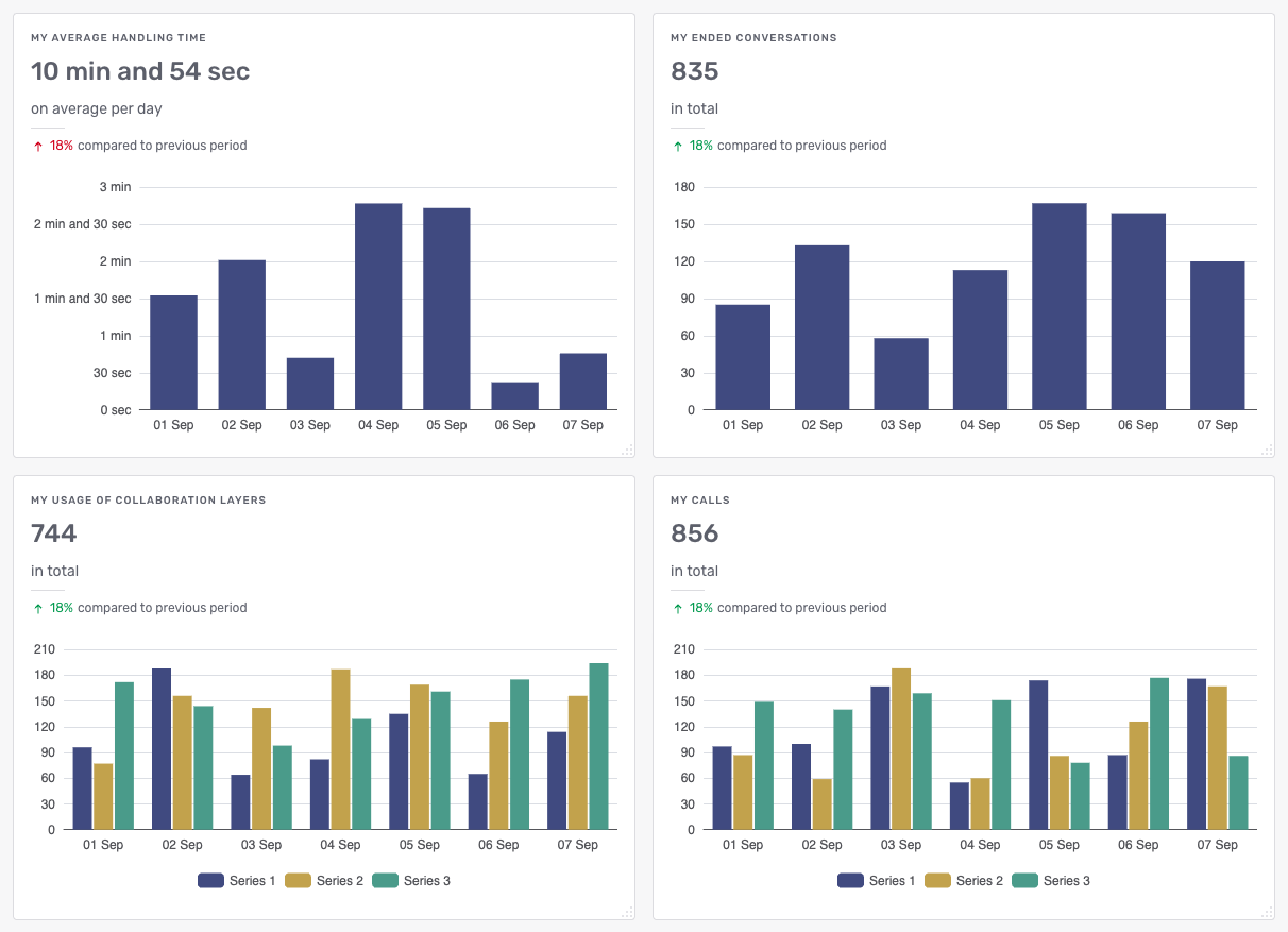
A dashboard displays its KPI widgets in a grid. On narrower screens, the widgets reflow and stack vertically.
Widget elements
A widget can display the following elements, depending on its configuration:
-
A headline number: the KPI’s value over the selected timeframe, calculated either as a total or as an average per granularity unit.
-
A comparison of the headline number with the equally long period immediately before the selected timeframe, labeled compared to previous period.
-
A line or vertical bar chart with one data point per granularity unit.
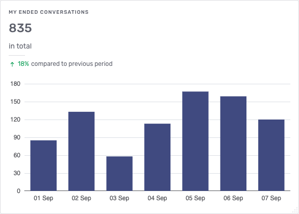
If a widget has a description or a headline number, it includes a More information button. Click it to display a popup with the widget’s description and an explanation of how the headline number is calculated.
Grouping
A widget can break its KPI down by a grouping, such as the assigned team or the conversation template. The chart then shows a separate series for each value of the grouping, for example one line per team.
When you group a widget by a grouping with many values, the chart could have too many series to read. The widget then shows only the values with the highest totals and groups the rest into a single series labeled Other. For example, a widget grouped by message sender shows the most active senders individually and the rest as Other. The number of values shown individually is set by a configurable limit.
If a grouping refers to an entity that no longer exists, such as a deleted team, the widget labels the grouping Unknown team followed by the entity’s ID.
How widgets respond to the dashboard’s filters
Each widget in a dashboard can have its own timeframe, granularity, and filters, defined in the widget’s configuration. Such a widget doesn’t reflect the corresponding filters you apply to the dashboard. For how widgets are configured, refer to Creating and editing widgets.
Available KPIs
For a definition of each KPI, including how it’s calculated and the groupings and filters it offers, refer to Analytics KPIs.
See also
-
For an overview of Unblu Spark’s analytics capabilities, refer to Introduction to Unblu analytics.
-
For information on setting up account-based analytics, refer to Setting up account-based analytics.
-
For information on configuring dashboards and their widgets, refer to Analytics dashboard configuration.
-
For a definition of each KPI, refer to Analytics KPIs.
-
For an overview of the Agent Desk, refer to the Agent Desk guide.