Analytics dashboard configuration
This is a preview feature. It may be subject to change or removal with no further notice.
To enable preview features, set com.unblu.platform.enablePreview to true.
For more information on preview features, refer to the Unblu release policy.
You manage analytics dashboards in the Account Configuration interface, under Analytics dashboards. This article describes how to create dashboards and configure their key performance indicator (KPI) widgets. It also covers how to control which dashboards agents see.
Creating a dashboard
To create a dashboard, click New dashboard in the dashboards overview. This opens a fly-in page where you enter a name and, optionally, a description. The name must be unique within the account. When you’ve finished, click Save.
You can also create a dashboard through the web API, using the /analytics/dashboards/create endpoint.
To create a dashboard from a template instead, see Dashboard templates.
You delete dashboards in the dashboards overview.
Editing a dashboard
To edit a dashboard, click it in the dashboards overview. The dashboard opens, displaying its widgets on a flexible six-column grid, with the Dashboard configuration panel on the right. You can rearrange widgets directly on the grid by dragging and dropping them, and resize them by grabbing the dotted bottom right corner. On narrower screens, the widgets reflow and stack vertically in a single column, and you can’t move or resize them.
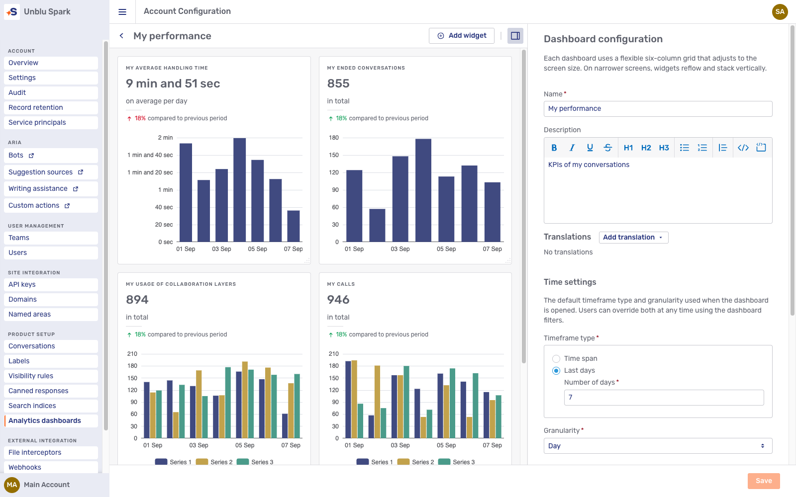
Dashboard configuration
The dashboard configuration panel contains the dashboard’s settings, described below. The time settings and global filters also apply to any widget set to follow the dashboard. Selecting a widget opens the widget editor in the right panel; to return to the dashboard’s settings, click Back to dashboard configuration or an empty area of the grid.
Translations
You can translate the dashboard’s name and description. Users see the translation that matches their language. For how Unblu selects the display language for translatable entities, refer to Localization.
Time settings
In the Time settings section, you define the default timeframe and granularity used when the dashboard is opened. Users can override both at any time using the dashboard filters.
The Timeframe type options are:
-
Time span: A period relative to the current date: Today, Week to date, Month to date, Quarter to date, or Year to date. These ranges include the current day, up to the present time.
-
Last days: The specified number of full days before today. The current day isn’t included.
The Granularity determines the time buckets that the dashboard’s widgets display: Minute, 15 minutes, 30 minutes, Hour, Day, Week, or Month.
Global filters
In the Global filters section, you use the checkboxes under Select filters to determine which filters are available to users on the dashboard:
-
Conversation template
-
Language
-
Engagement type
-
Recipient
-
Assigned agent
-
Assigned team
Global filters apply to a widget only if the widget’s Filtering type is Globally synced (the default) and the widget supports the filter. A widget with a Fixed filtering type uses only its own filters and ignores the dashboard’s global filters. Widgets ignore any global filter they don’t support; for example, the Average waiting time widget doesn’t support the Assigned agent or Assigned team filters.
For a worked example of how a widget combines its own filters with the dashboard’s, see Grouping and filtering.
Creating and editing widgets
To add a widget, click Add widget and select a widget type. Each widget type displays one of Unblu’s predefined KPIs. A dashboard can contain any number of widgets.
For the available KPIs, refer to Analytics KPIs.
The widget editor opens in the right panel. While you configure a widget, the preview on the grid displays sample data so you can assess the widget’s layout and configuration. The dashboard’s real data is visible in the Agent Desk. Widget names and descriptions can be translated.
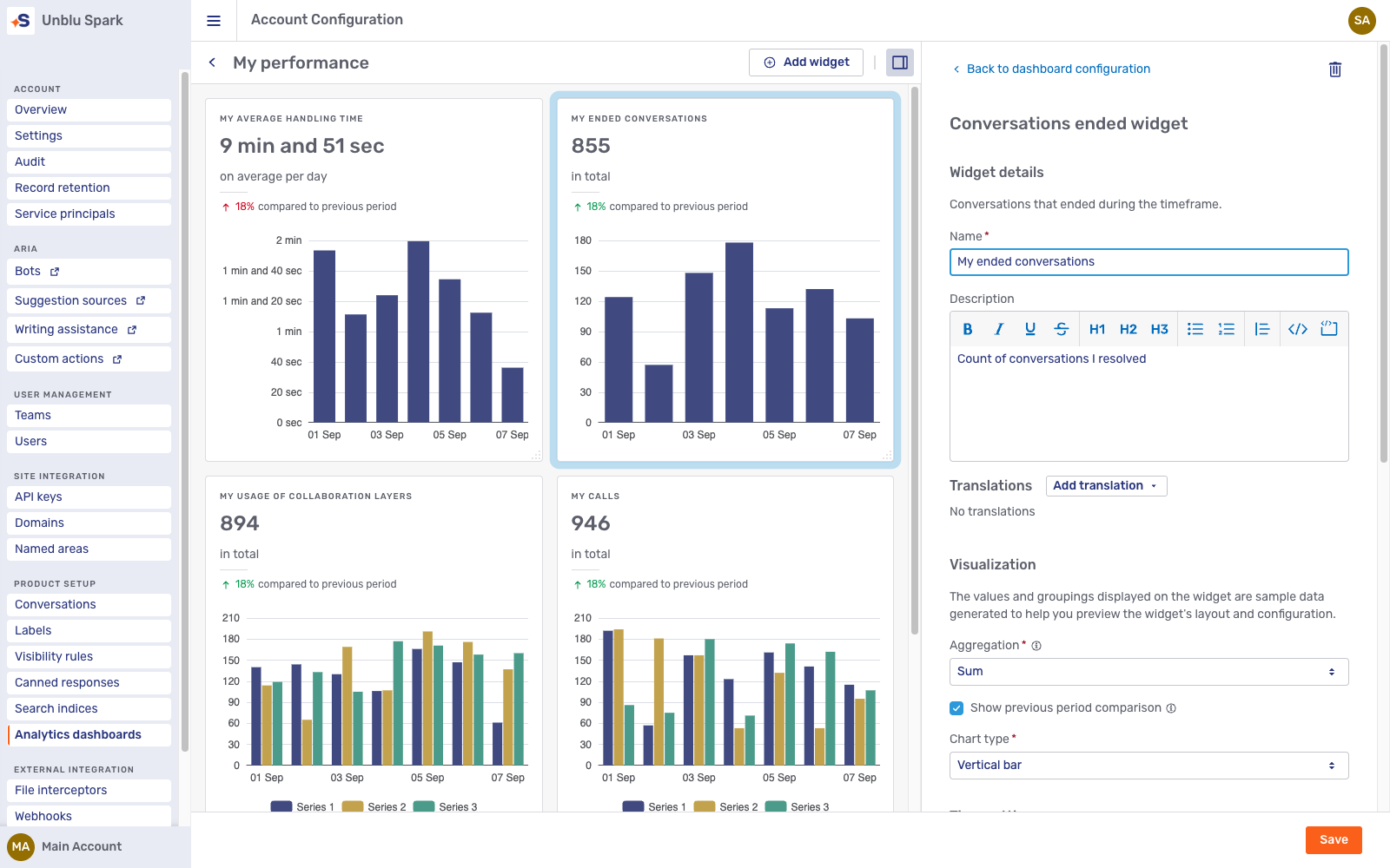
To delete a widget, select it and click the delete icon  in the top right of the widget editor.
Visualization
The Aggregation setting controls how the widget’s headline number is calculated for the selected timeframe:
-
Sum: The total over the timeframe. For averaged KPIs such as the waiting time, this is the overall average across the entire period.
-
Average: The value averaged per granularity unit, for example per day if the granularity is set to Day.
-
None: The widget displays no headline number.
Select the Show previous period comparison checkbox to compare the current value with the value of the equally long period immediately before the selected timeframe, for example the last 7 days against the 7 days before that.
The Chart type setting determines whether the widget includes a Line chart, a Vertical bar chart, or no chart at all.
Timeframe and granularity
Each widget either follows the dashboard’s time settings or uses its own:
-
The widget’s Timeframe type offers the same options as the dashboard’s, plus Globally synced. A globally synced widget uses the dashboard’s timeframe; with any other option, the widget uses its own timeframe.
-
The Granularity type options are Globally synced and Fixed. A globally synced widget uses the dashboard’s granularity; a fixed widget uses the granularity you select.
Grouping and filtering
Use Group by to break the KPI down by a grouping (also called a dimension). The available groupings depend on the widget type. All widget types support groupings such as the recipient, conversation template, locale, and engagement type. In addition, each KPI offers specific groupings, such as the message type for messages or the call end reason for calls; for the full list per KPI, refer to Analytics KPIs.
The Filtering type determines whether the widget combines its filters with the dashboard’s global filters:
-
Globally synced: Applies both the widget’s filters and the dashboard’s global filters. When the same filter is set in both, the widget only shows data matching both.
-
Fixed: Applies only the widget’s own filters.
For example, suppose a widget’s own filter limits it to the Sales and Support teams, while the dashboard’s global filter is set to the Support and Billing teams. A globally synced widget shows data for the Support team only, the team the two filters have in common. A fixed widget ignores the global filter and shows data for the Sales and Support teams.
In the Filter by section, click Add filter to restrict the data the widget displays. The available filters depend on the KPI type. If you select multiple values within a single filter, the widget shows data that matches any of the selected values (OR). If you add multiple filters, the widget only shows data that matches all the filters (AND).
Dashboard templates
Unblu Spark provides four dashboard templates:
-
Customer support (
SUPPORT): KPIs related to the queue. -
Account overview (
GENERAL): KPIs on the volume of conversations. -
Advisory (
ADVISORY): KPIs related to advisory conversations in the secure messenger. -
My performance (
AGENT): KPIs of an agent’s personal conversations.
There are two ways to create dashboards from these templates:
-
Call the web API endpoint
/analytics/dashboards/createFromTemplateto add a dashboard based on a template to an account. Specify the template by its type, shown in parentheses above. If you don’t specify a name, the dashboard is named after the template. -
Enable com.unblu.analytics.dashboard.addDashboardsFromTemplatesToNewAccounts to add a dashboard for each template to every new account on creation. The property is in the
GLOBALscope and only affects accounts created after you enable it. Existing accounts are unaffected.
Dashboards created from a template are regular dashboards named after their template. You can rename, edit, and delete them like dashboards you created yourself.
Dashboard visibility
By default, agents can choose between all the account’s dashboards in the Agent Desk.
To restrict which dashboards agents see, enable com.unblu.analytics.dashboard.seeConfiguredDashboardsOnly and select the permitted dashboards in com.unblu.analytics.dashboard.visibleAnalyticsDashboardIds. Agents then only see the dashboards you select. If you don’t select any, agents see no dashboards at all. You can set both properties in the TEAM and USER scopes to give different teams or agents access to different dashboards. The restriction doesn’t apply to admins, who always see all dashboards.
com.unblu.desk.ui.showAnalyticsDashboards determines whether the Agent Desk displays the analytics navigation item. This lets you hide the navigation item for specific teams or agents.
Dimension limits
When you group a widget by a dimension with many distinct values, such as messages by sender, the result may contain more dimensions than the widget can display legibly. Two configuration properties limit the number of dimensions a widget displays:
-
com.unblu.analytics.dashboard.maxNumberOfDimensionsPerGranularity: The maximum number of dimensions per granularity unit. The default value is 15.
-
com.unblu.analytics.dashboard.maxNumberOfDimensionsPerWholeTimeframe: The maximum number of dimensions for widgets with the
WHOLE_TIMEFRAMEgranularity. TheWHOLE_TIMEFRAMEgranularity treats the entire timeframe as a single time bucket. The default value is 50.
If a widget’s data contains more dimensions than the applicable limit, the widget displays the dimensions with the highest totals over the timeframe and combines the rest into a single dimension labeled Other. The Other dimension counts toward the limit.
See also
-
For an overview of Unblu Spark’s analytics capabilities, refer to Introduction to Unblu analytics.
-
For information on setting up account-based analytics, refer to Setting up account-based analytics.
-
For information on the Account Configuration interface, refer to the Account Configuration interface guide.
-
For information on using dashboards in the Agent Desk, refer to the Analytics dashboard UI guide.
-
For a definition of each KPI, refer to Analytics KPIs.